Cooking is a metaphor for life. Anything can be explained with food analogies (or at least, everything should be to make it more interesting).
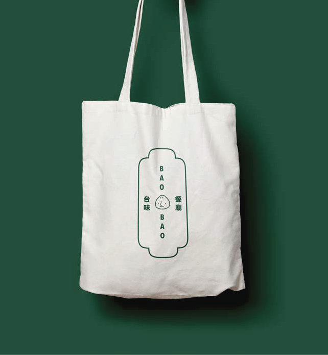
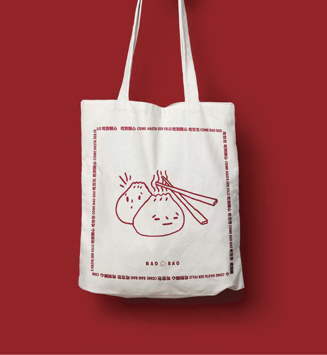
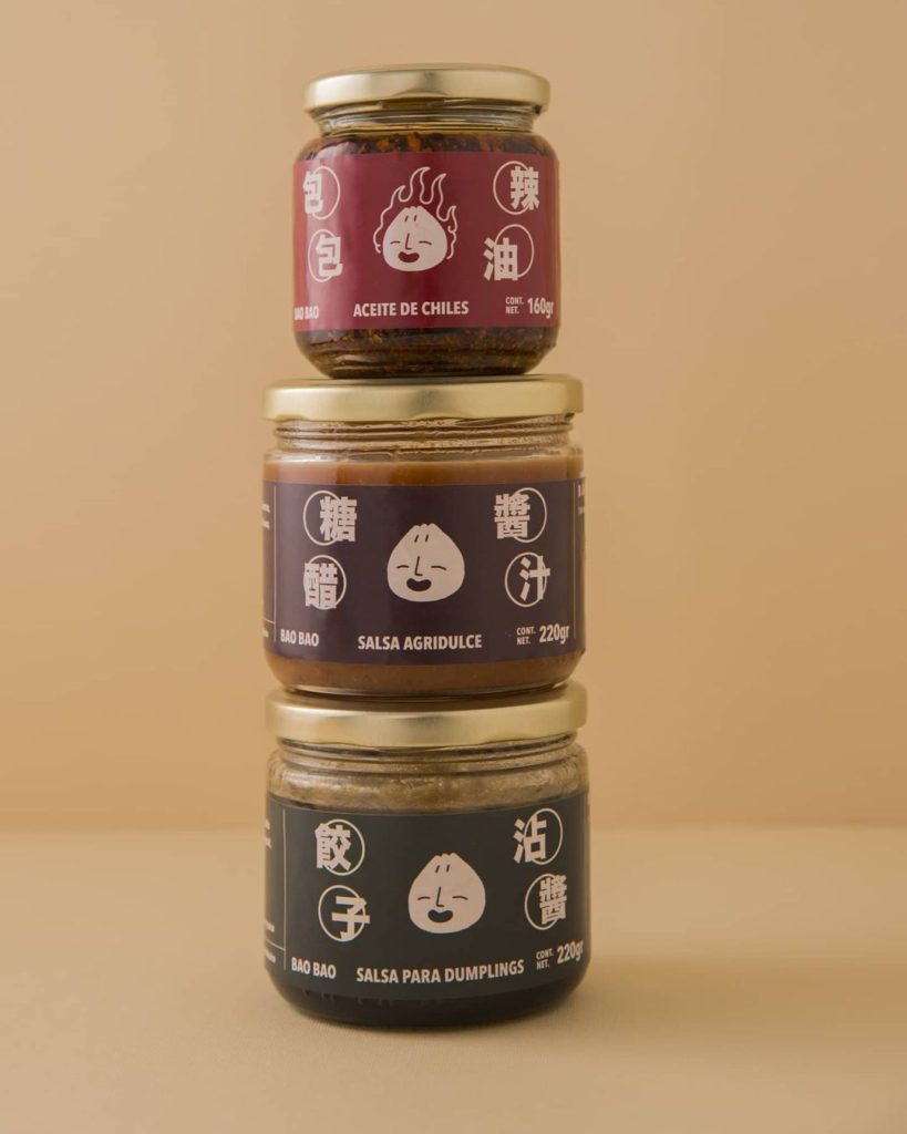
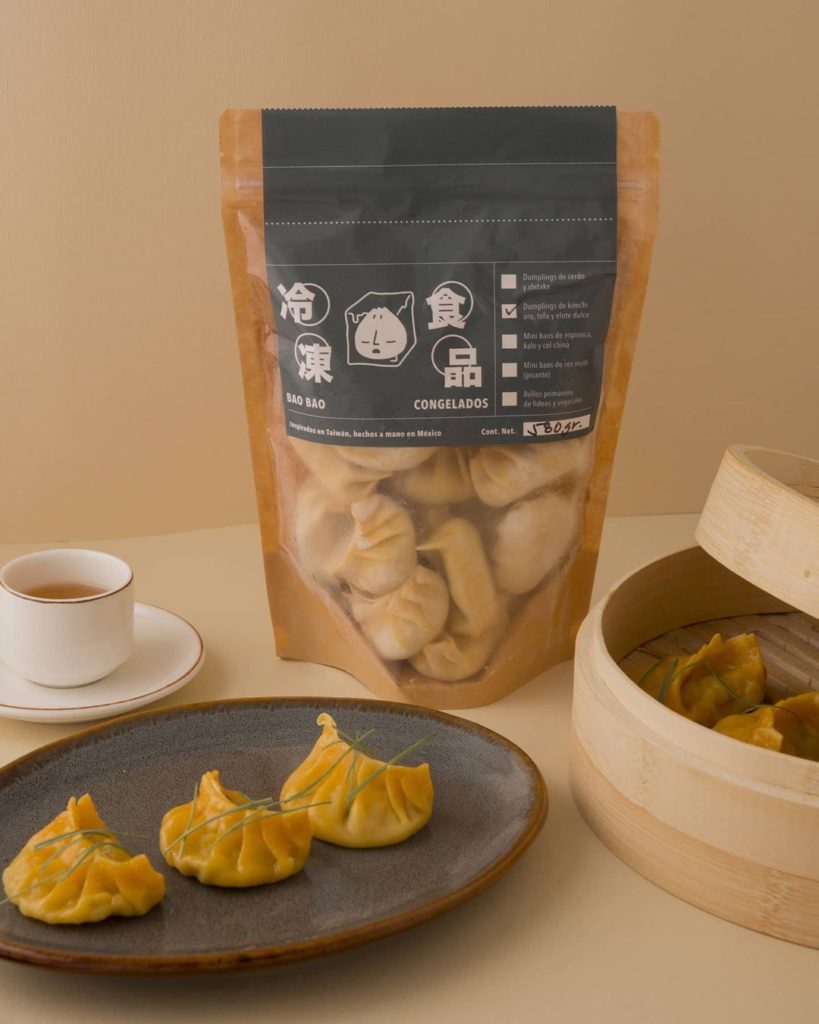
Take Bao Bao for example. Made with Mexican and Taiwanese ingredients, Bao Bao is crunchy-on-the-outside, fluffy-on the inside brand ready to be devoured by hungry eyes.
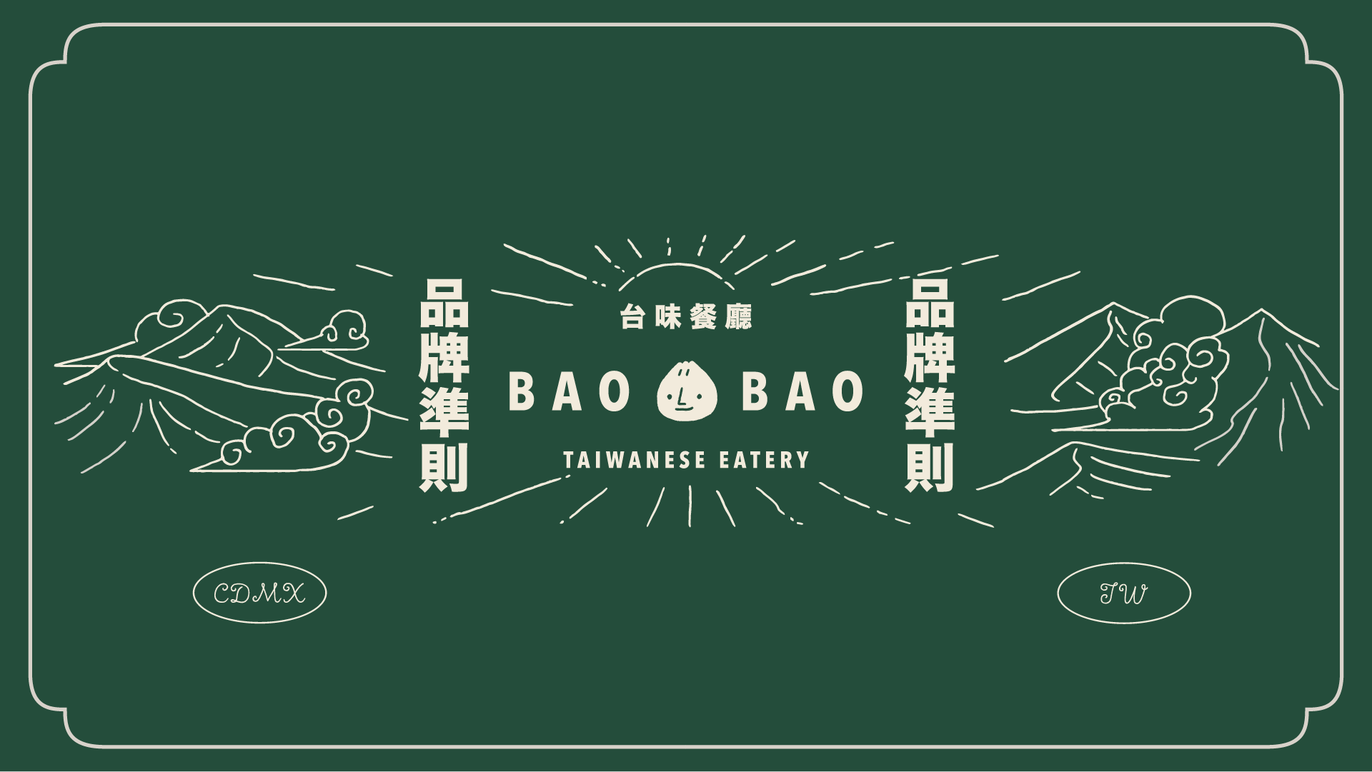
Brand Identity / Storytelling / Packaging
Inspired by Taiwan, made in Mexico.
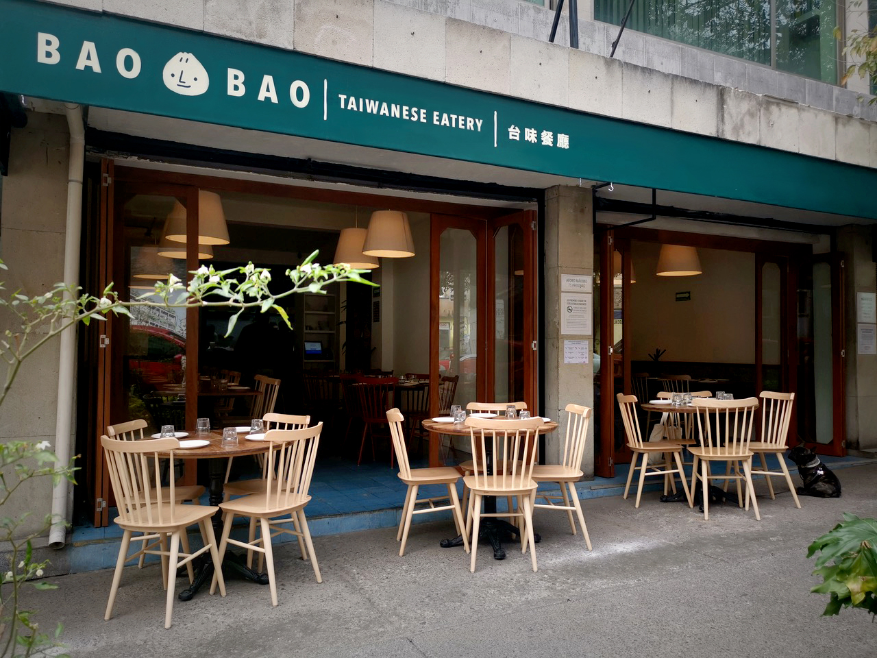
Bao Bao is a Taiwanese eatery in Colonia Roma, the hot-spot for cool eateries in Mexico City.
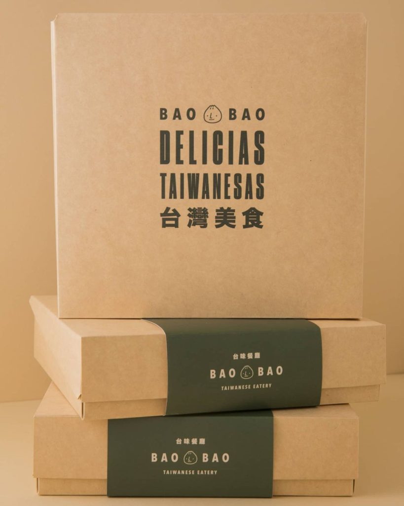
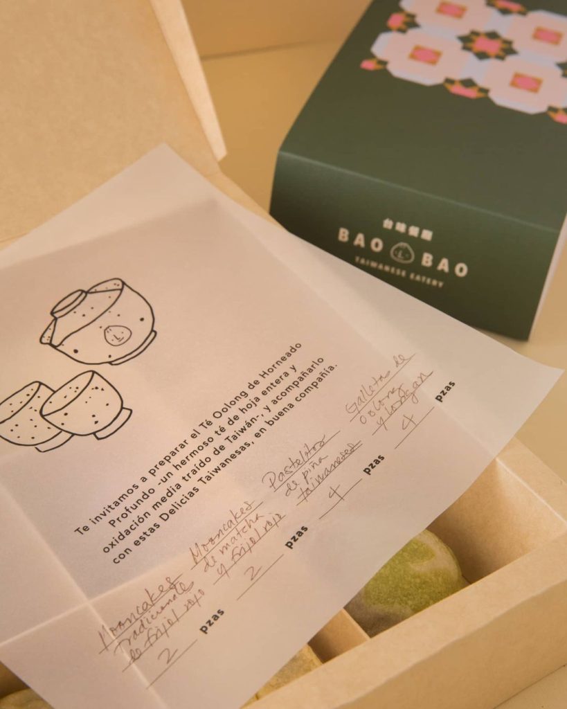
They use Mexican ingredients to cook authentic Taiwanese cuisine. It is a place made for everyone, from locals searching for new flavors, to expats who crave meals from their home country. To create an atmosphere of nostalgia-meets-modernity, we took inspiration from old Taiwanese newspapers and handmade signs to build the graphic for the restaurant. We used naif illustrations to create a friendly set of characters that make up the world of Bao Bao. Aren’t they so cute you just want to eat them? Well, good thing you’re in a restaurant.
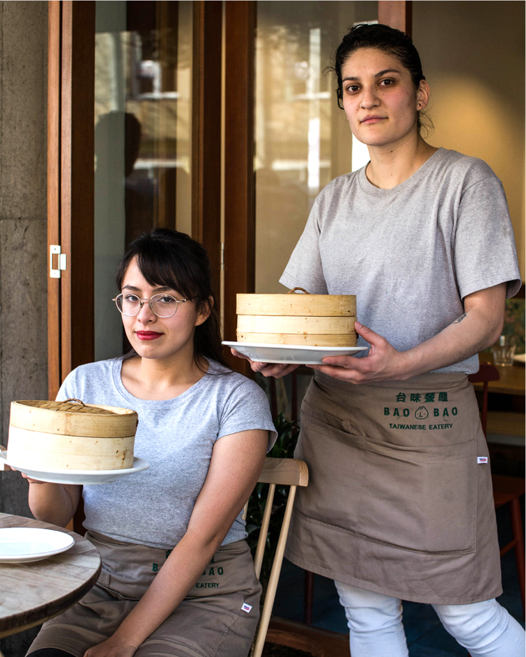
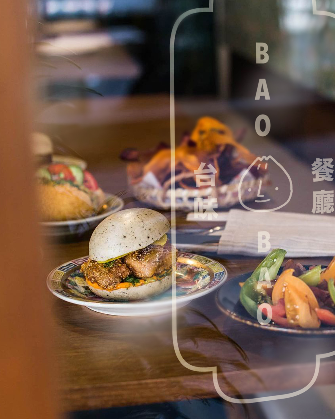
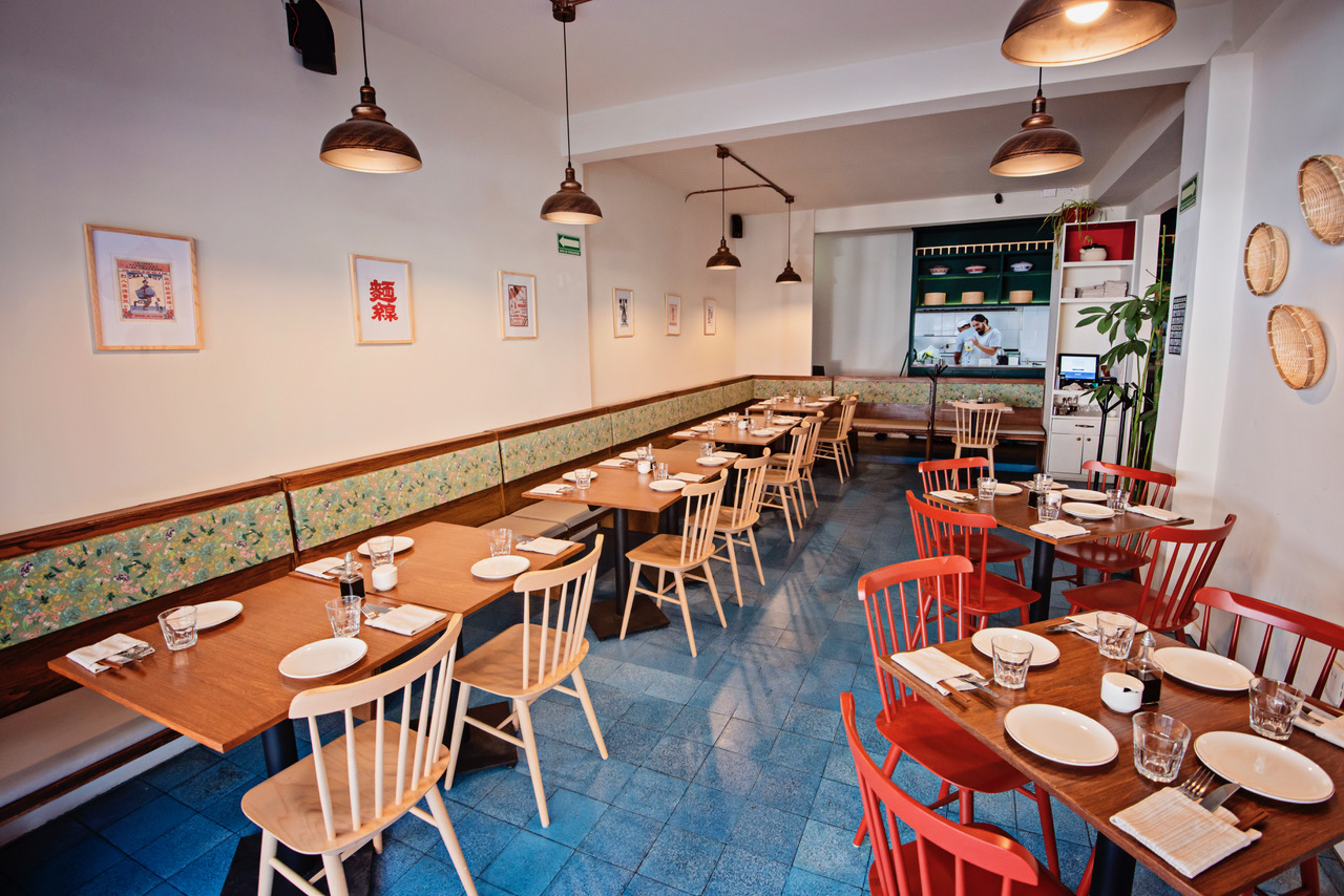
For a place with so much to say -they keep it real by using Spanish and Chinese for their communication- we used five different typographic families. This brand uses a lot of typographic compositions, so we wanted to give them lots of variety to keep creating. The main color palette was taken from the Mexican flag: red, green, and off-white. A simple combination to match the restaurant’s interior design. We got to build the branding before the opening of the restaurant, so there was constant communication with the client to see what could be done to the design that complemented the architecture, dish ideas, and merchandise. So, from menu design to packaging, we played around with the characters, typographic compositions, and colors, to build a fantastic Taiwanese corner in the heart of Mexico City.
Tenemos tanto que decir, que hasta hablamos en español y chino.