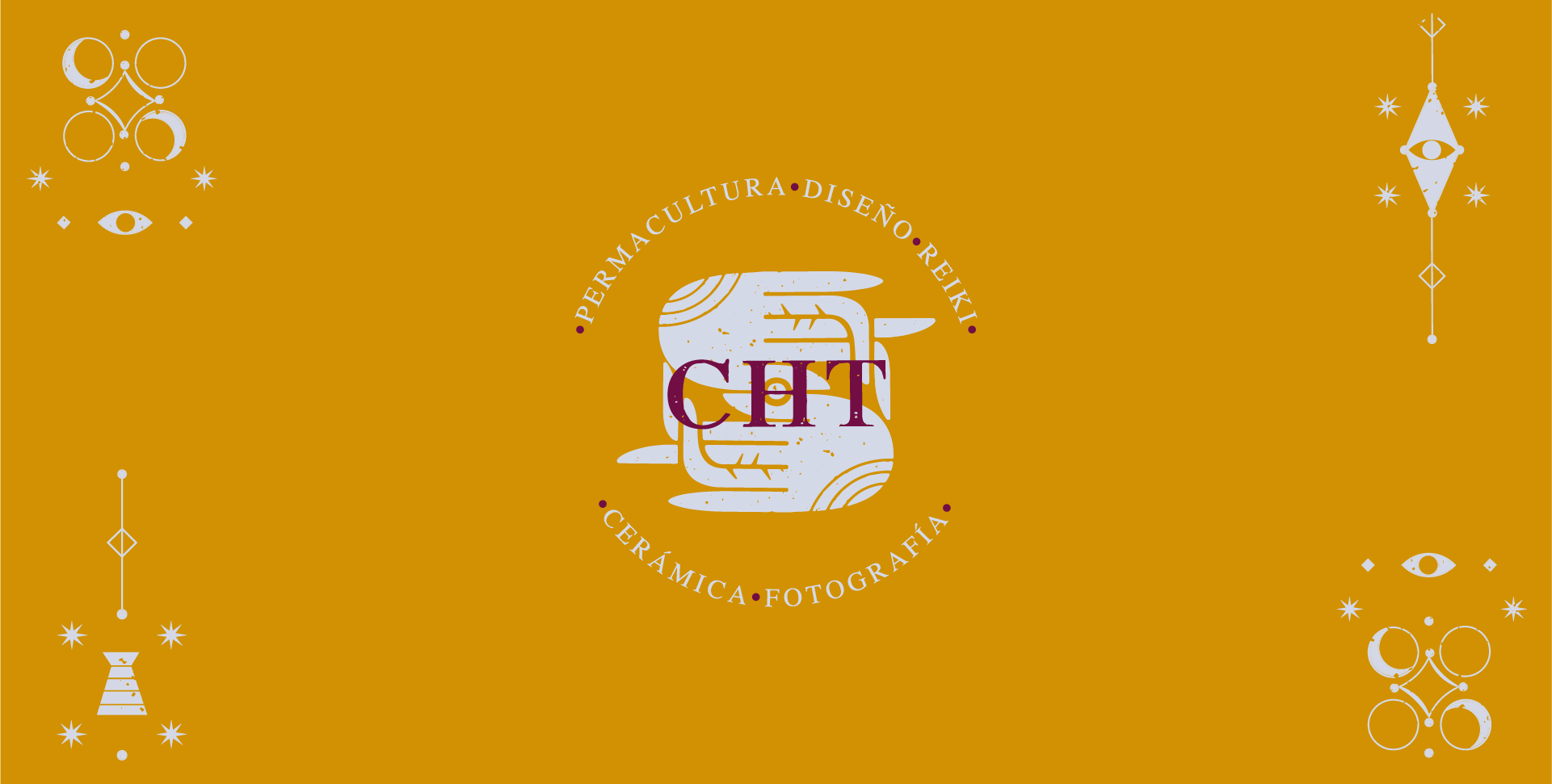
In the age of holistic wellness, Carolina Herrera Tamariz (CHT) started her own brand dedicated to her many trades. The author pushes the public to embrace a lifestyle where art, design, architecture, food, and health are an integral part of existence; where nature isn’t merely decoration, but a key component of life. Here, permaculture, design, healing oils and balms, reiki, ceramic, and photography come together under the same philosophy: everything we create carries a part of our spirit within.

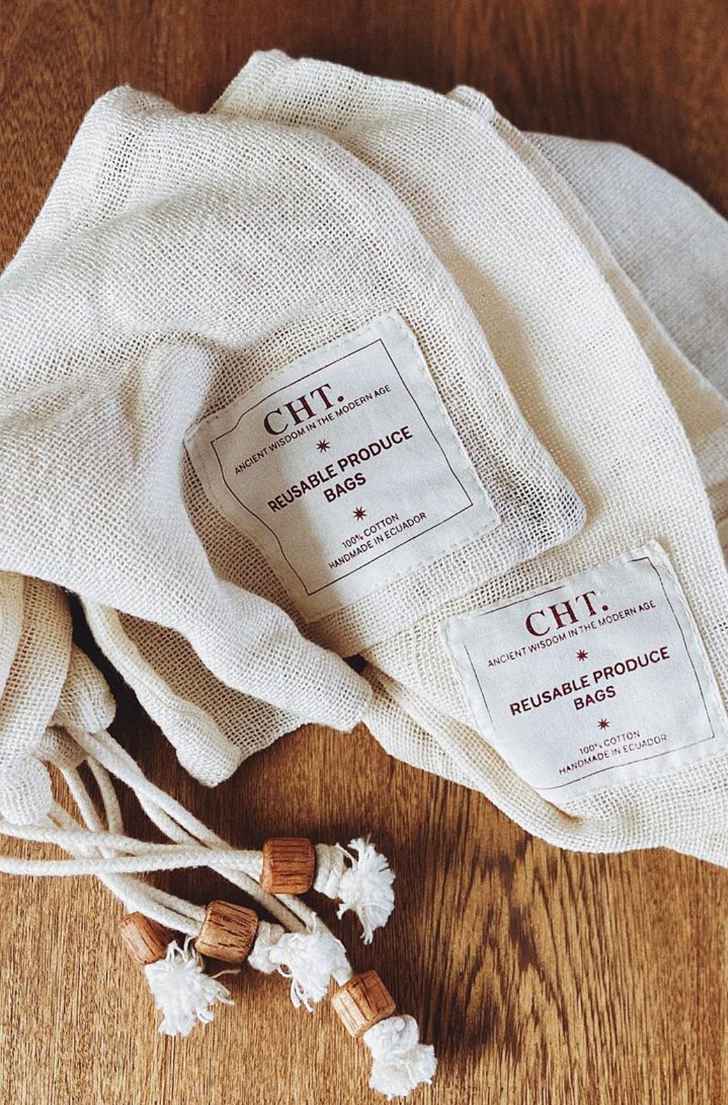
Packaging Design / Brand Identity
Ancient Wisdom in the Modern Age
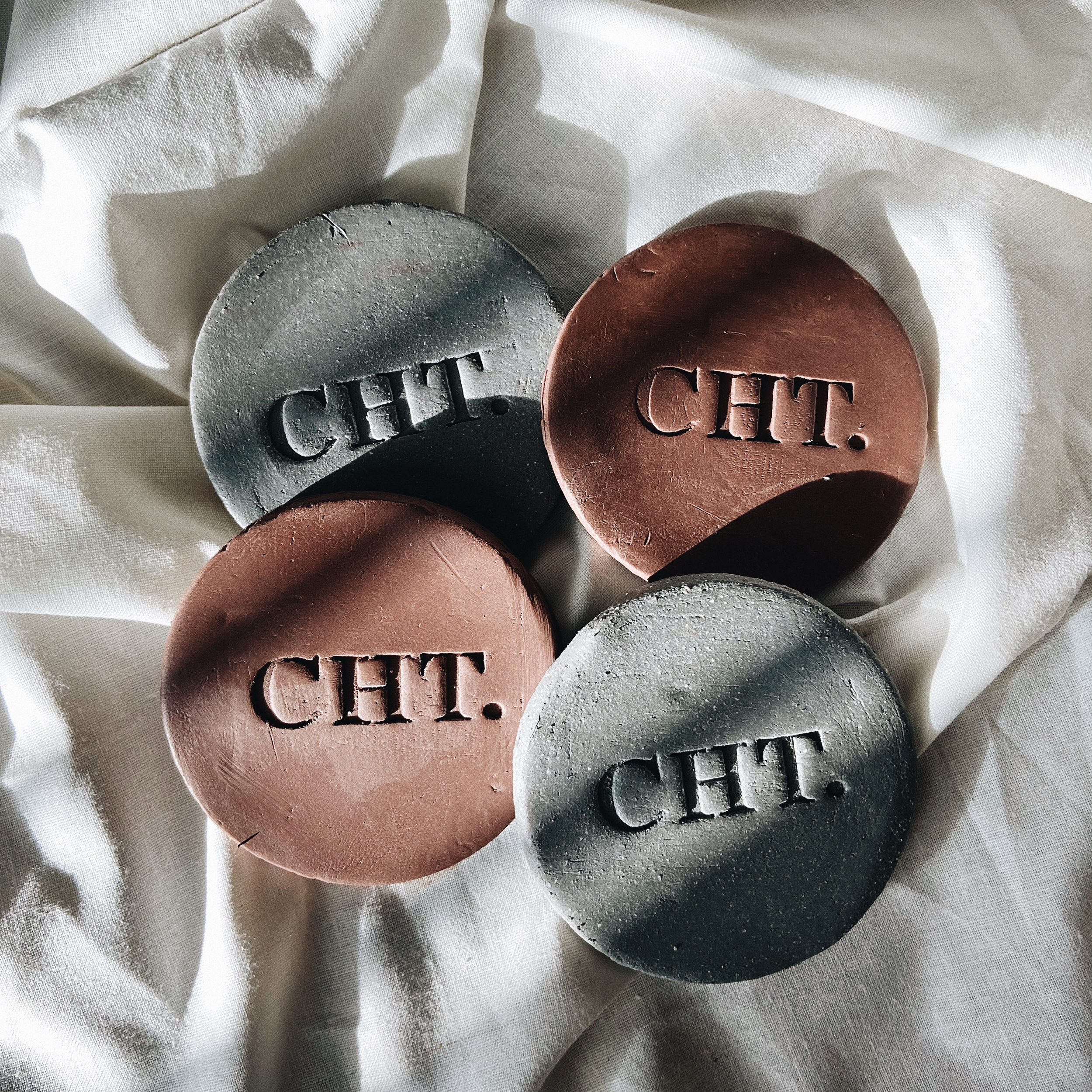
The logo represents the vision contained inside the maker’s hands, the energy coming from within transforming into vibrations. It plays like a mirror image to represent balance and action/consequence, and we gave it a stone-like texture for that homey, hand-made feeling that goes with the brand. With that same feeling in mind, we chose earthy colors inspired by the five elements (air, water, earth, fire, ether) that feel cozy and grounded.
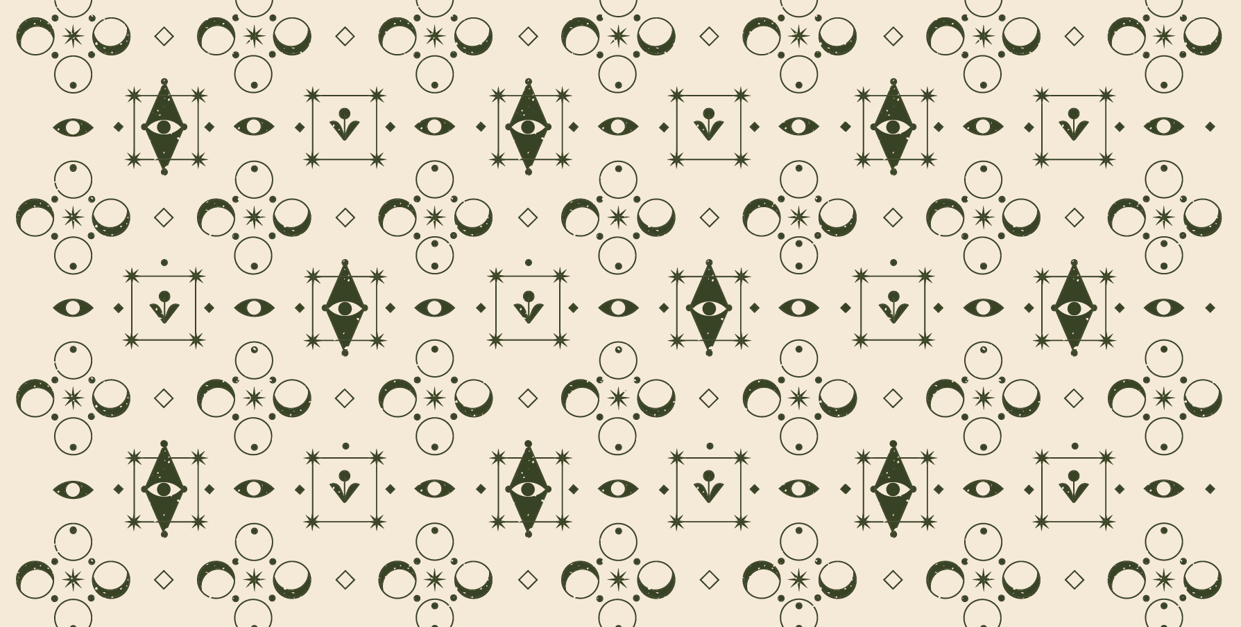
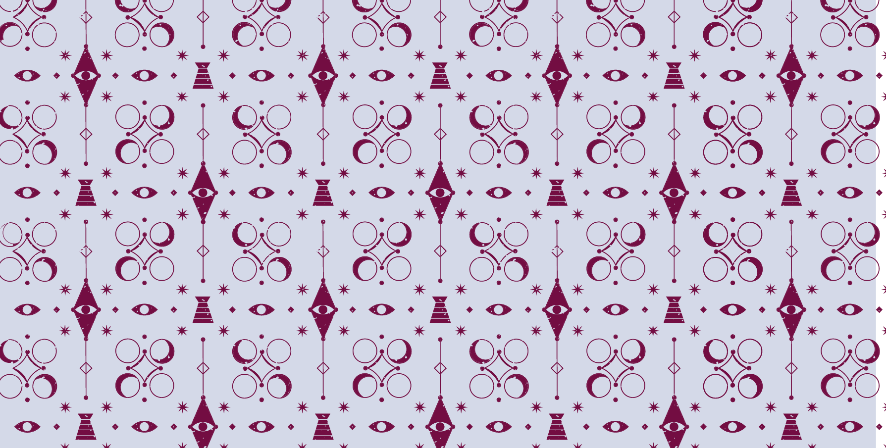
Because CHT sells a different variety of products and, we developed two patterns with astral and geometric objects that can be used as a whole in packaging and print. Each component of the pattern (the moon, the eye, the altar) can also be used as a set of icons to differentiate the brand’s products.