When we met Pablo and Valeria, the owners and founders of Fankør, a small and understated local coffee shop, we realized they were obsessed with coffee. But not in a snobbish way! Actually, this obsession resulted in them making one of the best cups of coffee we’ve ever tasted (and here in Ecuador, the bar is pretty high for that).
Packaging Design / Storytelling
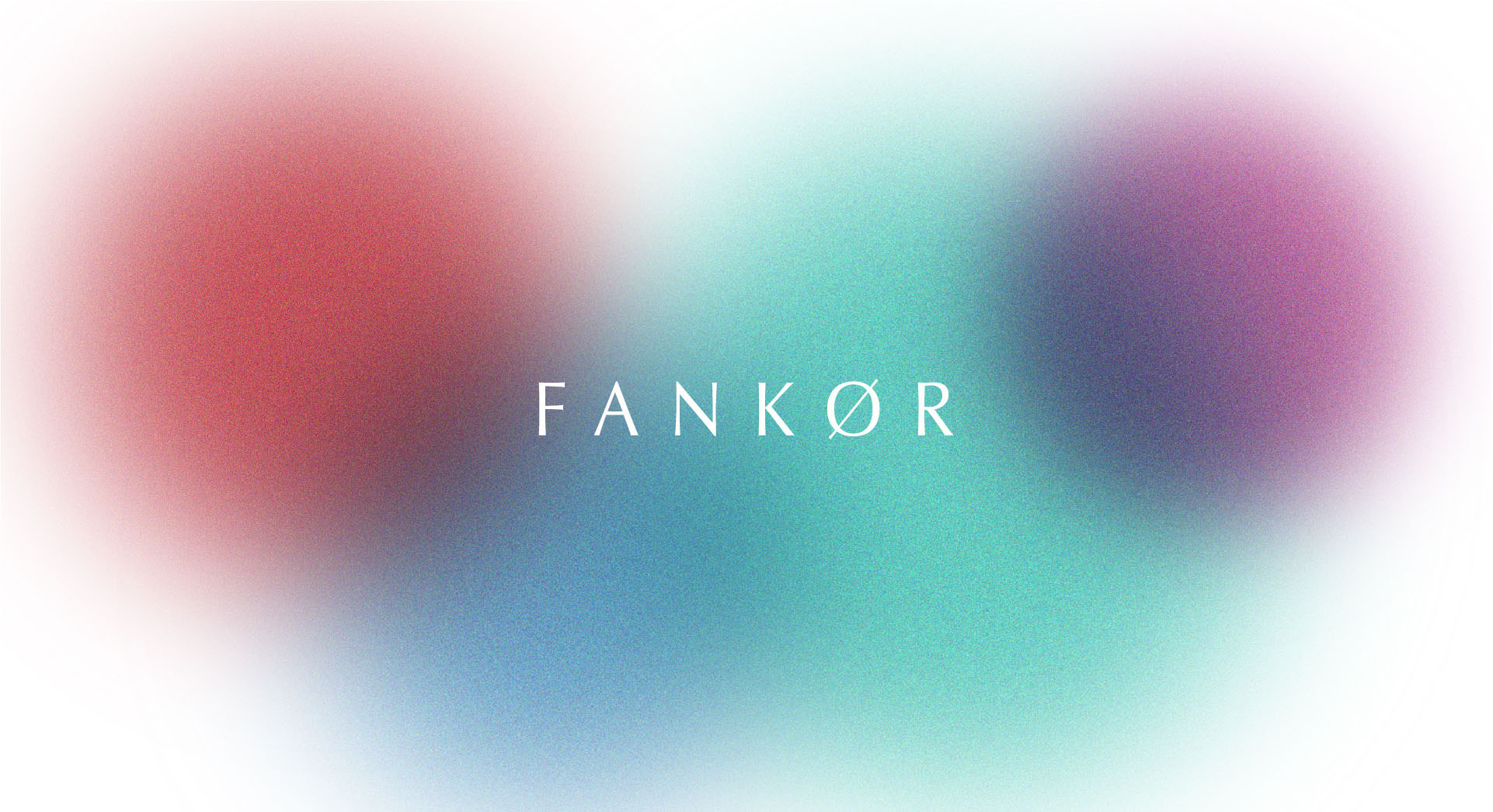
Inhala, exala. Bienvenido a casa

They came to us with a logo but no graphic identity to go with it, looking for a packaging solution that was beautiful, original, and inexpensive. And as so rarely happens, they spoke the magic words that turned them into one our favorite clients to this day: “we trust you, do whatever you want.”
That gave us room to explore freely, and what struck us the most about this brand was the way the founders talked about coffee and the whole experience around making it and drinking it. It was very sensory and intimate ritual, so we wanted to reflect that on the packaging.
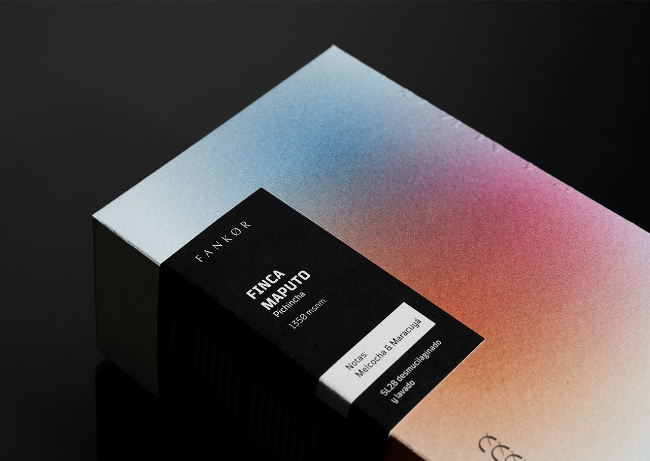

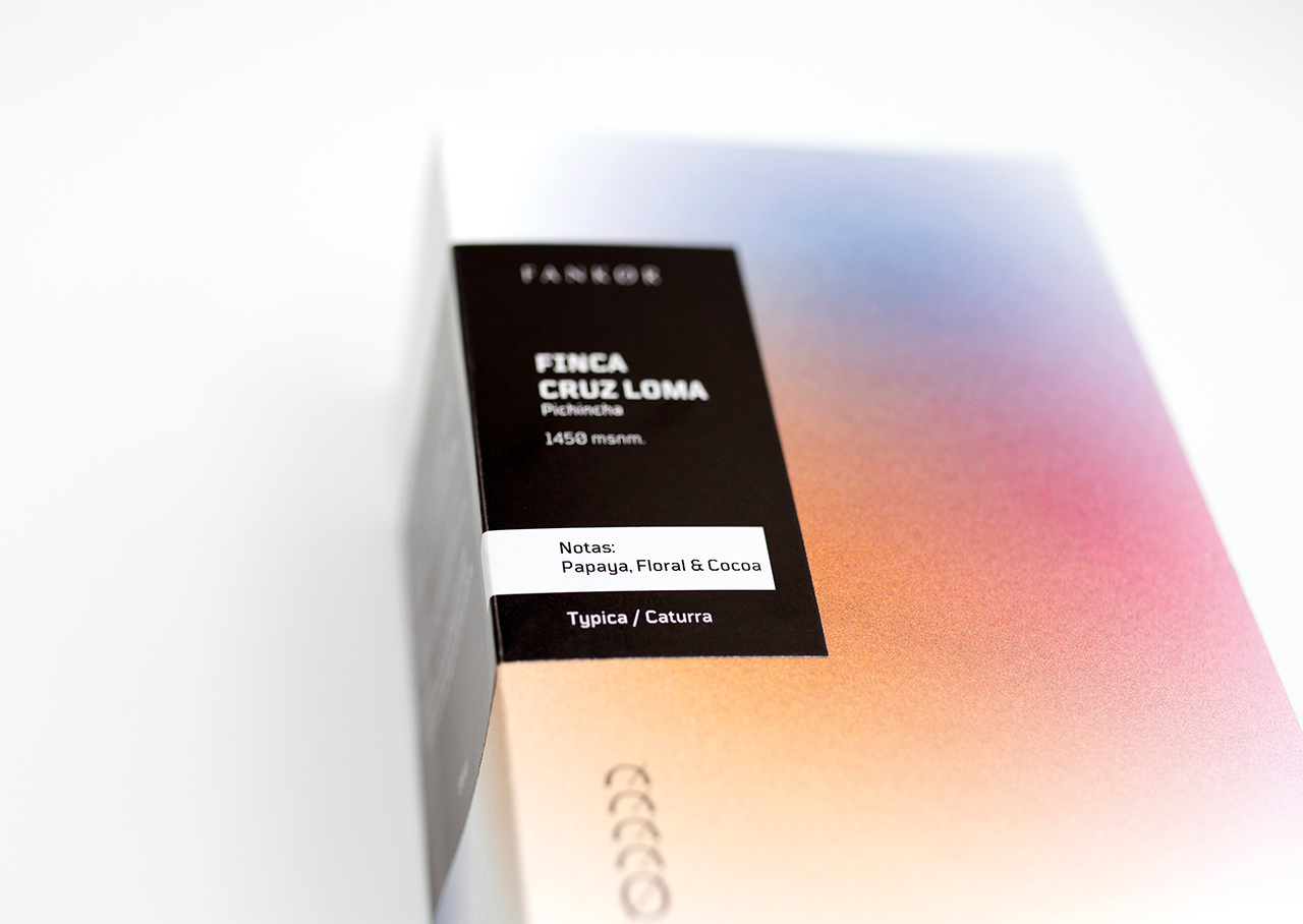
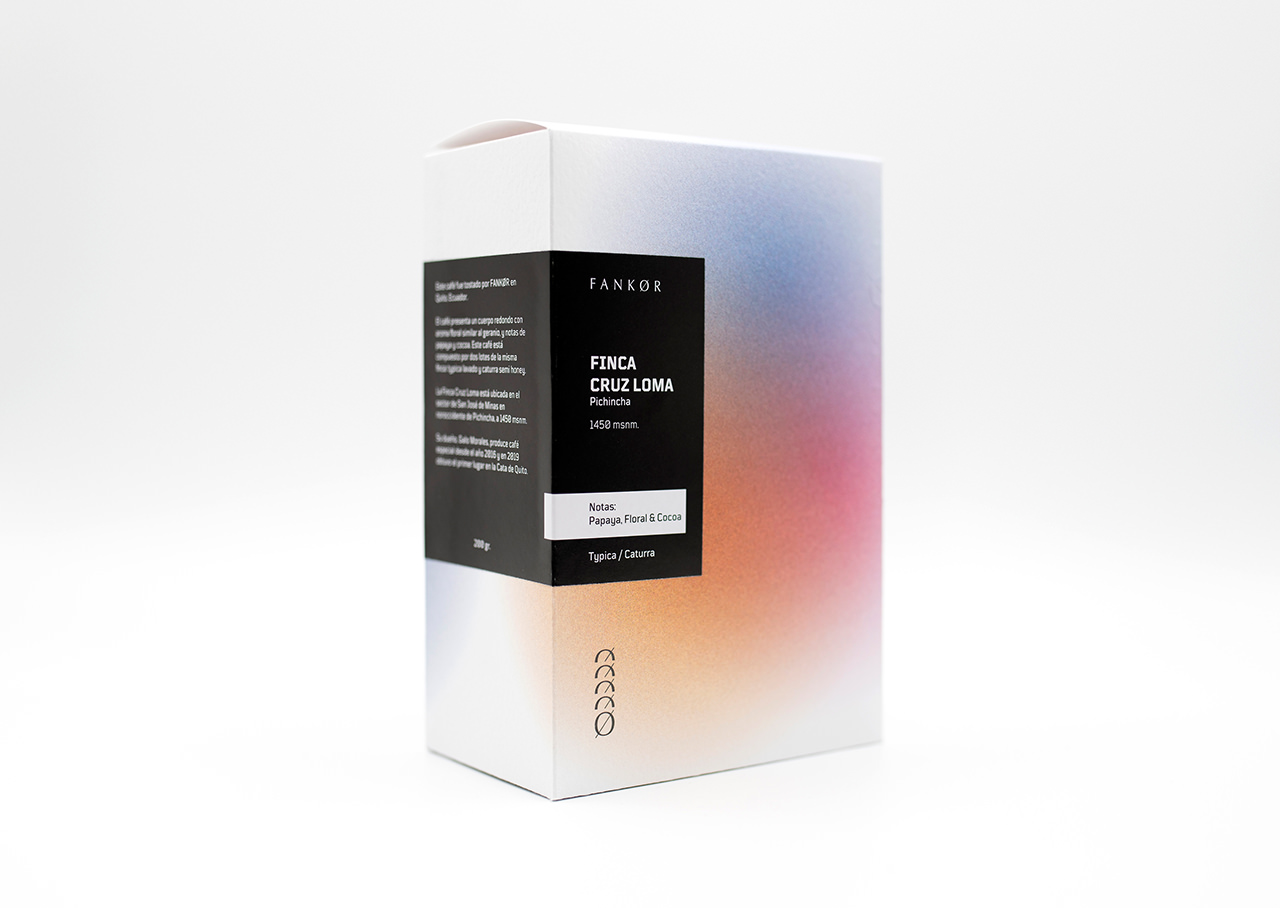
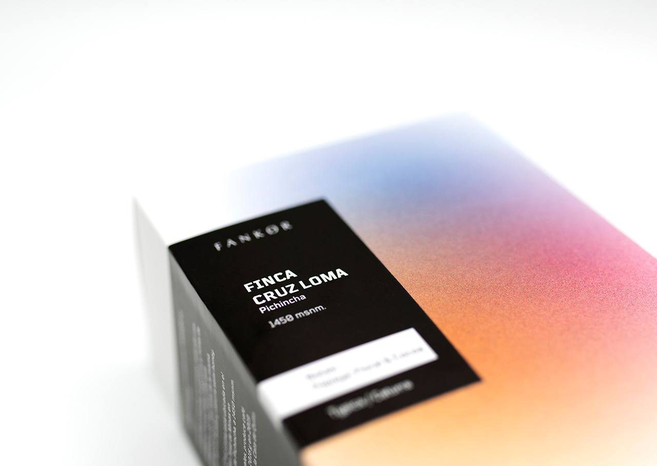
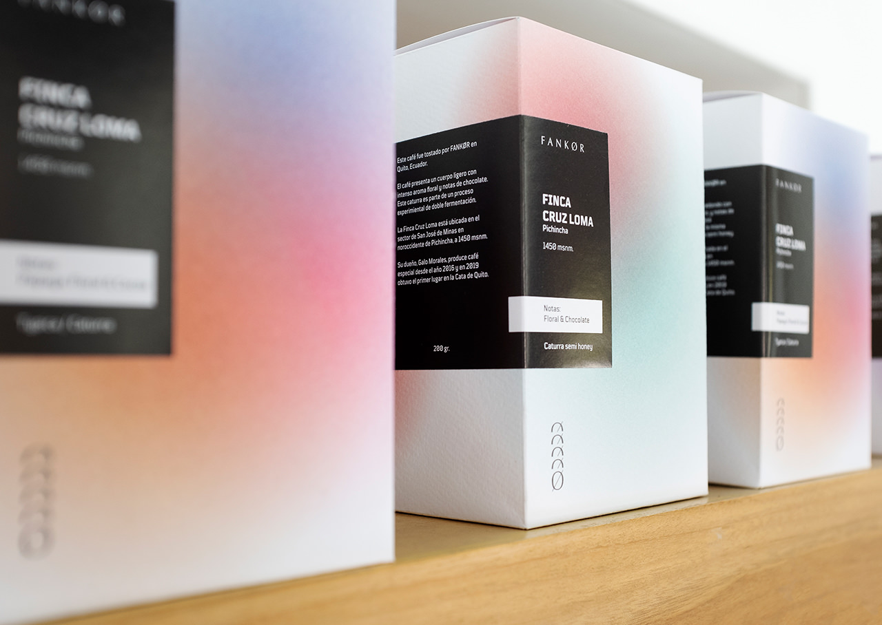
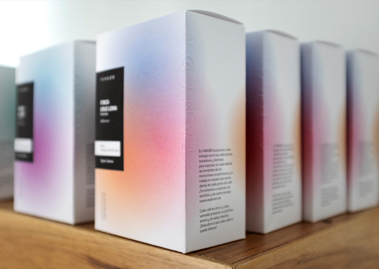
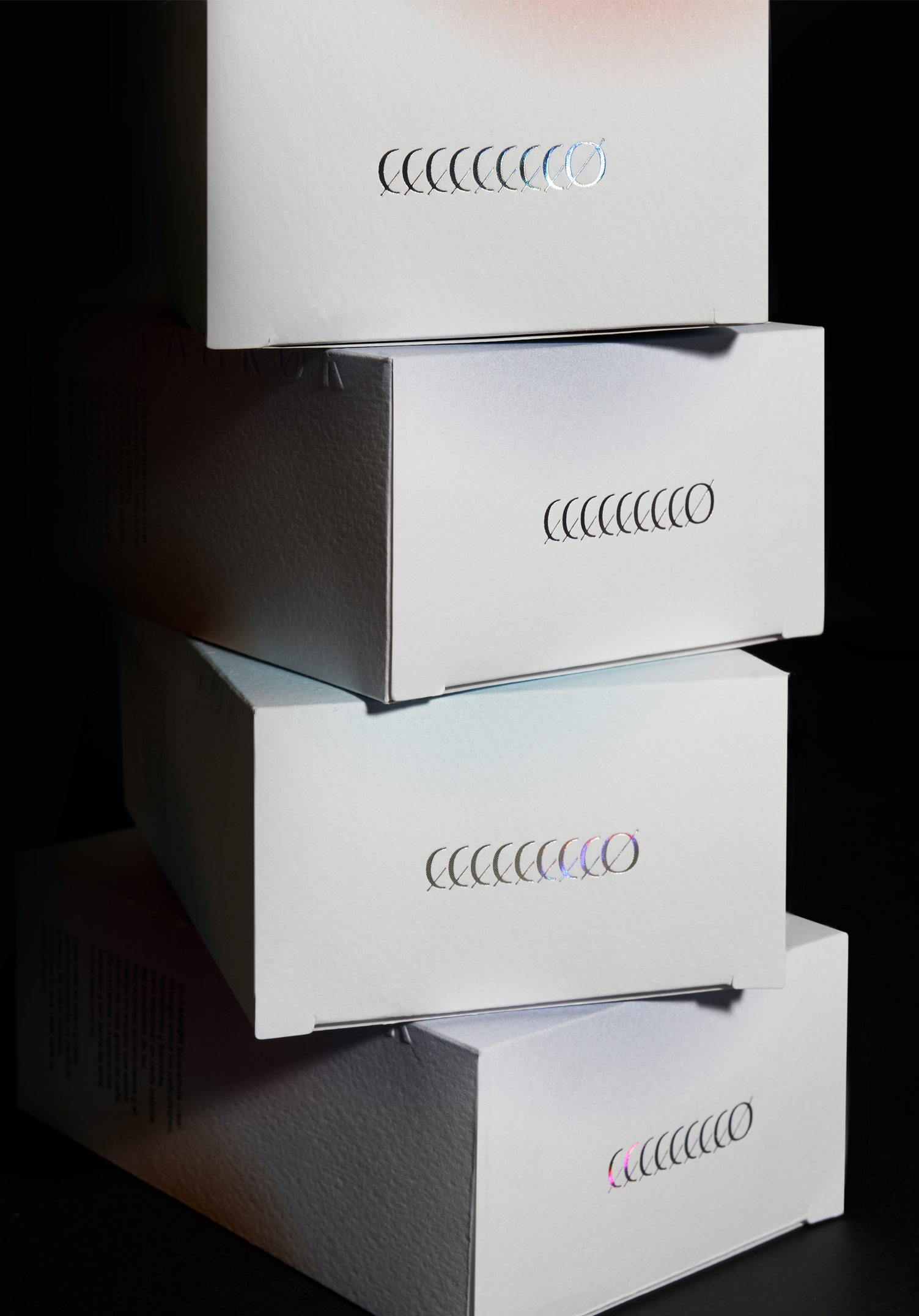
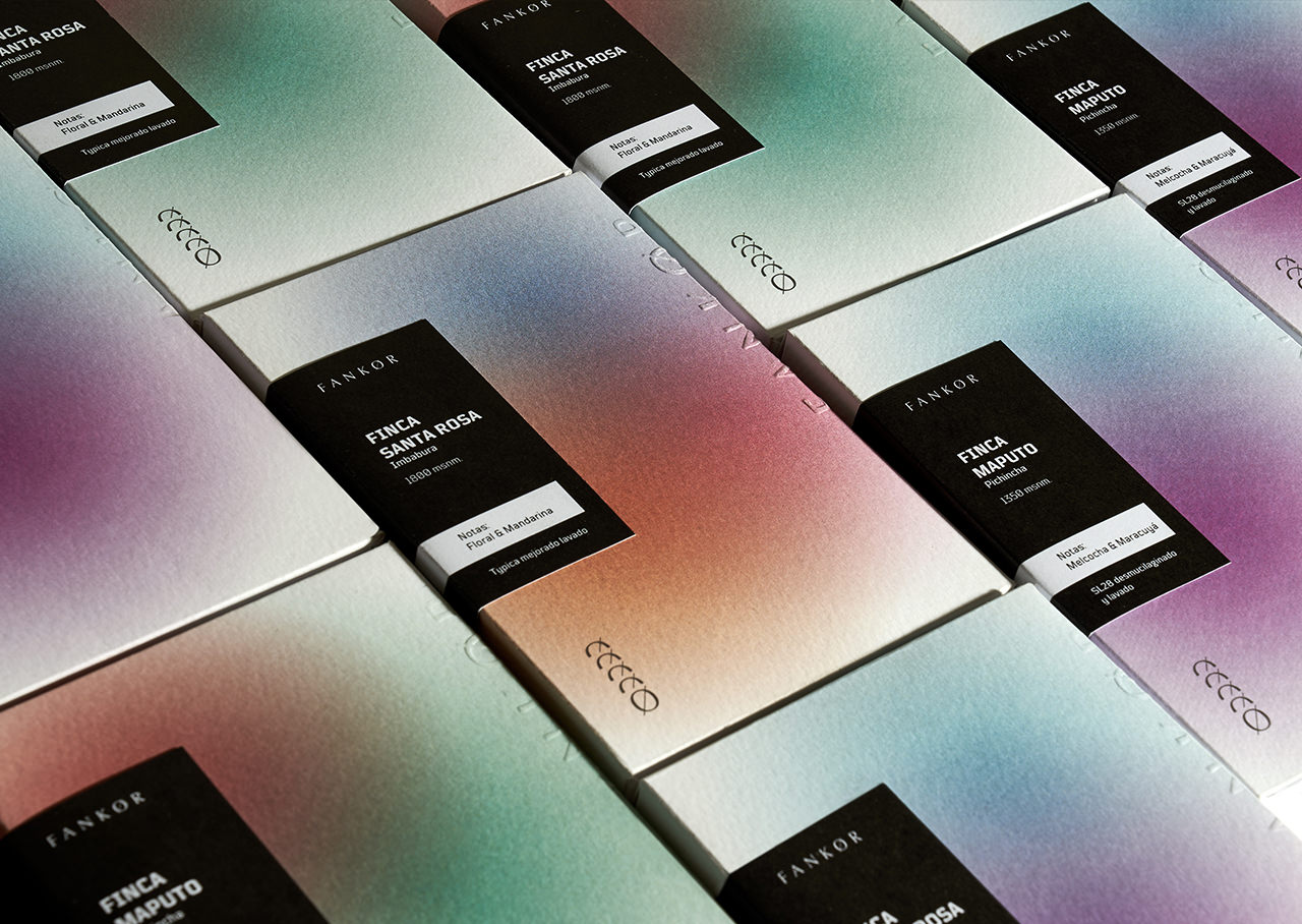
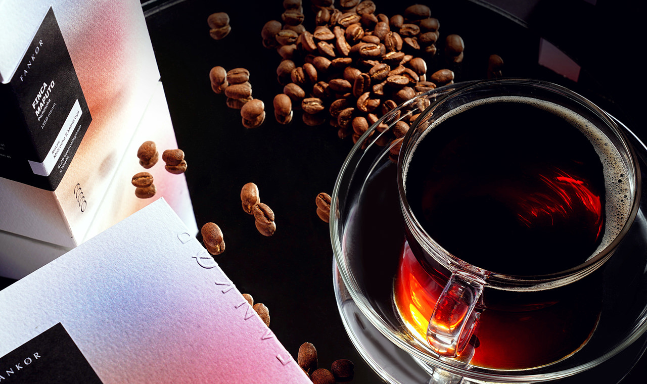
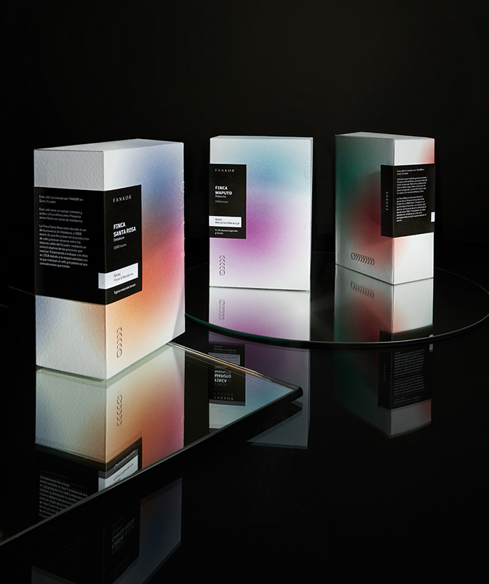
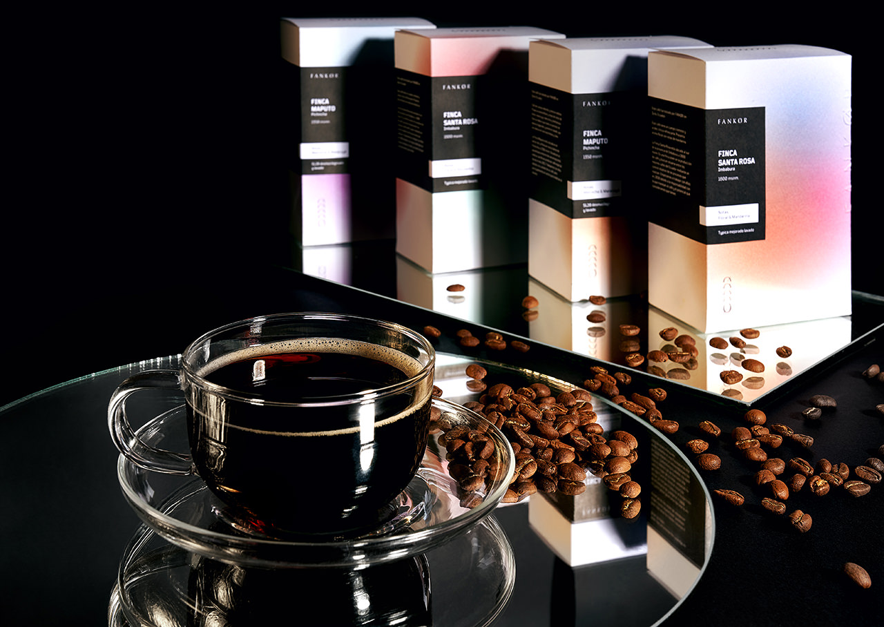
We asked ourselves: how would the flavors, textures and smells in a cup of coffee look like if they were colors? And developed a packaging system based on the color palettes we created, one for each farm the coffee is harvested in.
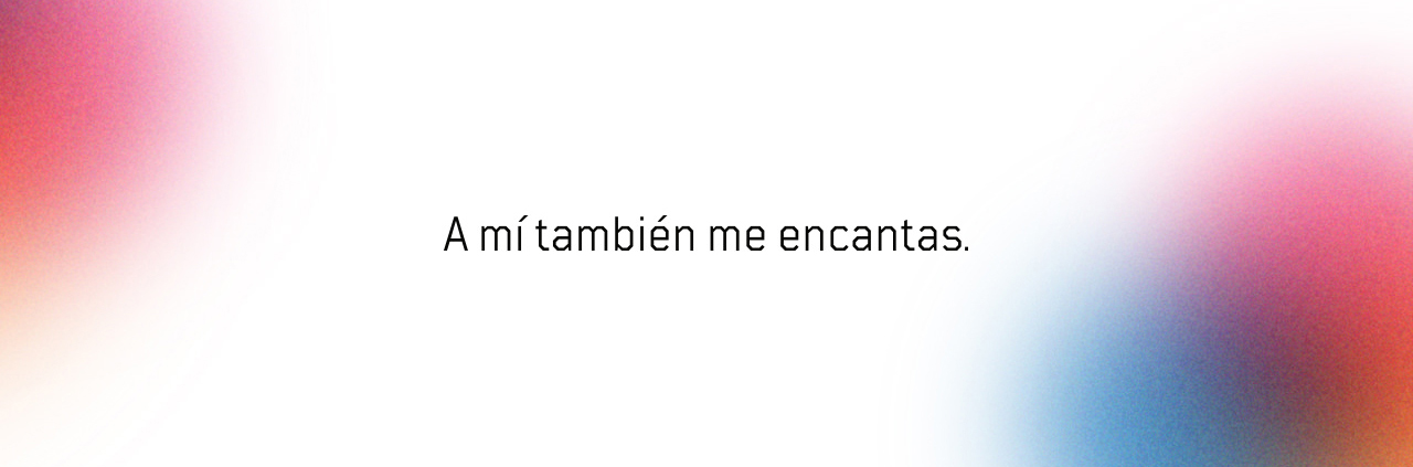
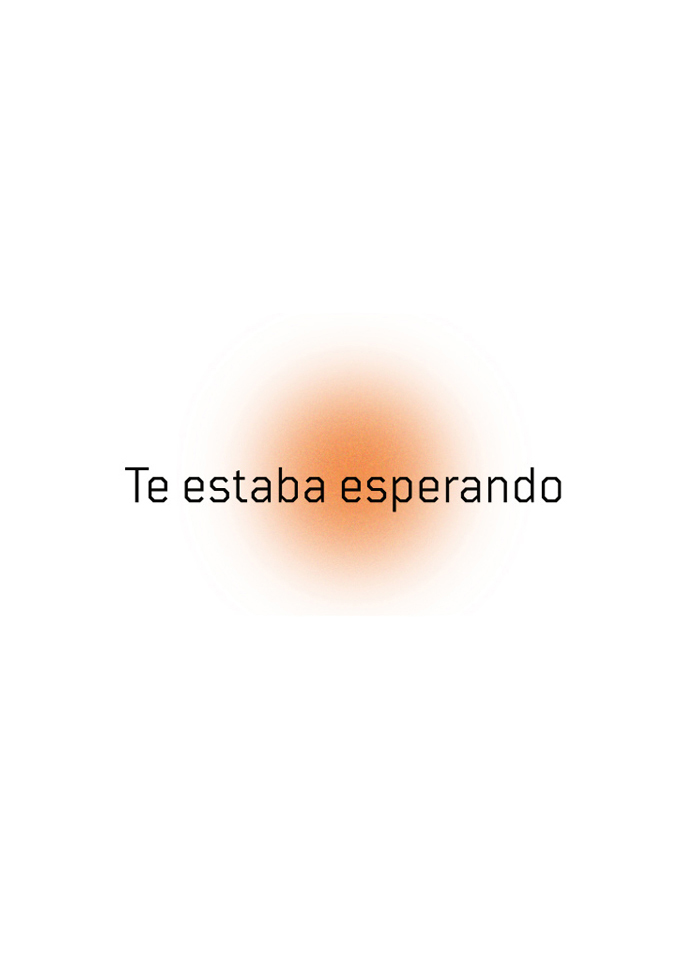
When costumers open the box, they are greeted with a small phrase on the top that changes with each flavor. “I was waiting for you” and “I adore you too” were created with coffee lovers on our mind, to honor the intimate ritual they have when making and drinking coffee. We wanted them to feel like their coffee is talking to them, so they develop a deeper emotional connection with the brand. “Inhale, exhale. Welcome home” is for that feeling you get when you smell coffee: it feels like home.