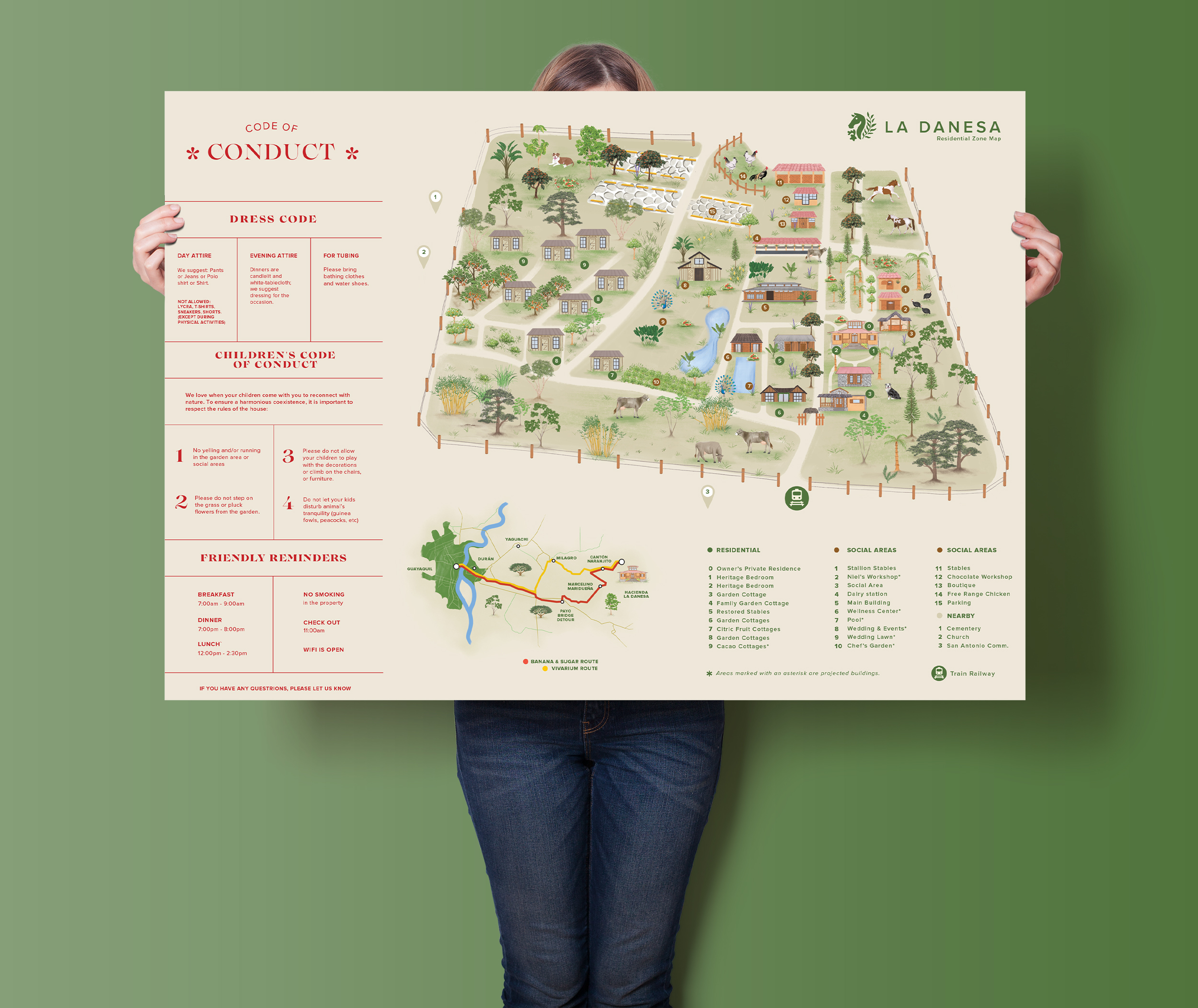
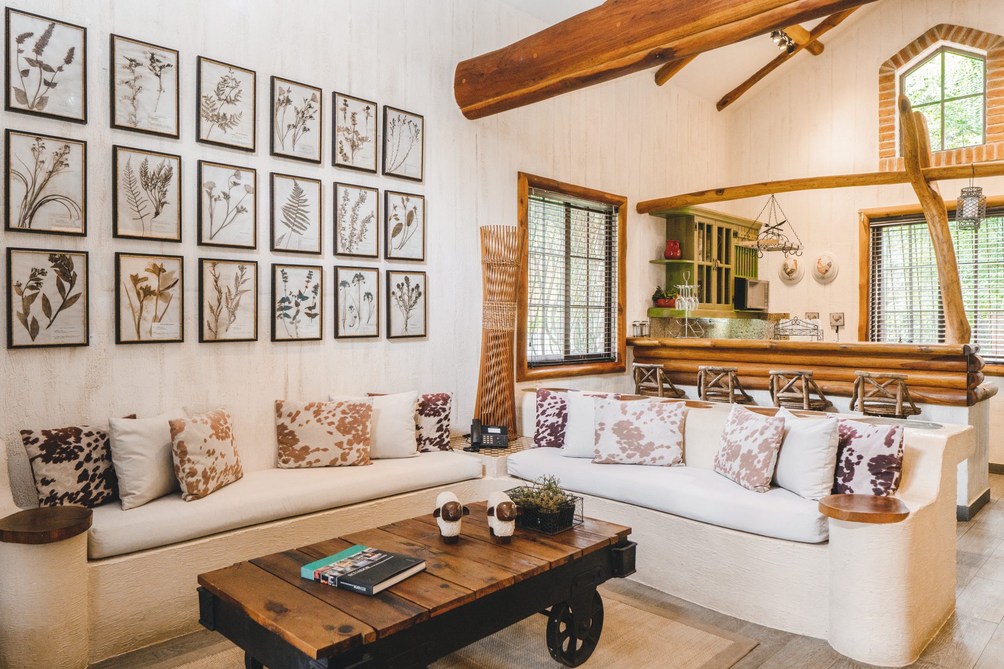
La Danesa is a real special place. It was originally the childhood home of our client Niels Olsen, who, after backpacking in Europe and doing a masters in hospitality, fell in love with traveling and decided to turn the hacienda into a small luxury stay for travelers from all over the world.
Niels is a young man who grew up in the country, swimming in the river, riding horses, and climbing mango trees; he is not afraid to get his hands dirty (and he often does). But he is also a very classy guy who enjoys good wine and art. We were nervous about working with him at first, but he turned out to be one of the most enthusiastic, laid-back, cool clients we’ve had. He not only has great taste, but he also gave us a lot of creative freedom to work on La Danesa’s branding.
Rebranding/ Packaging Design / Illustration / Storytelling
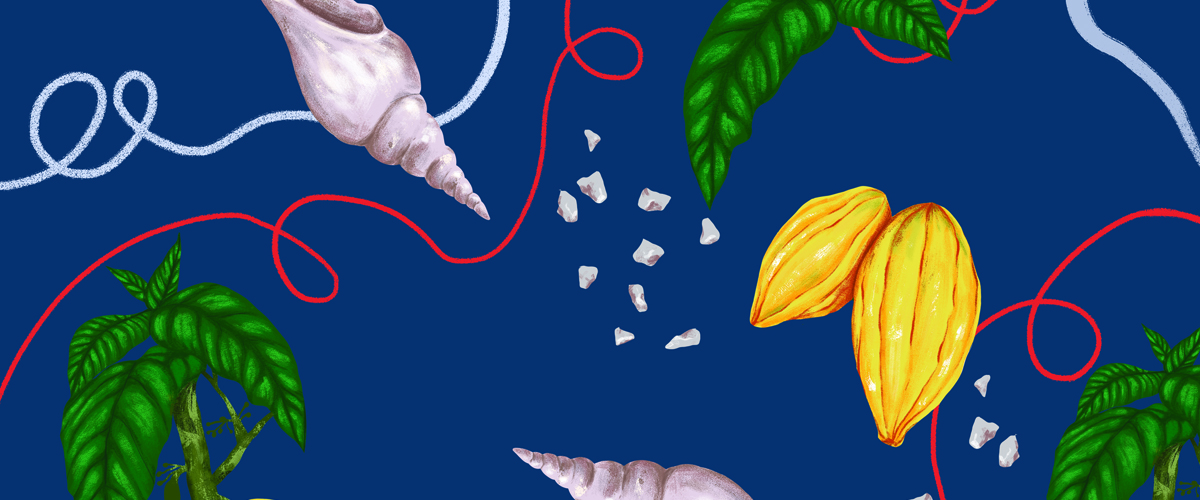
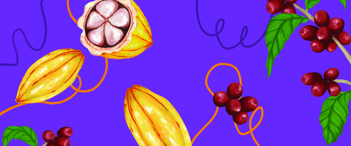
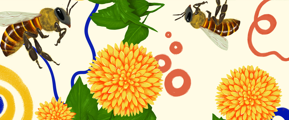
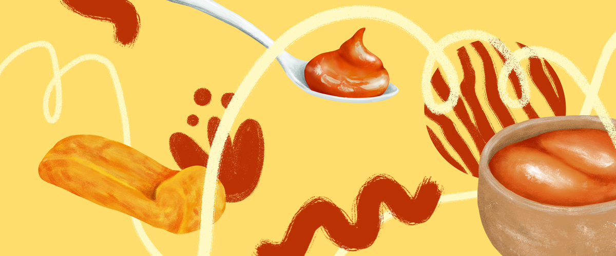
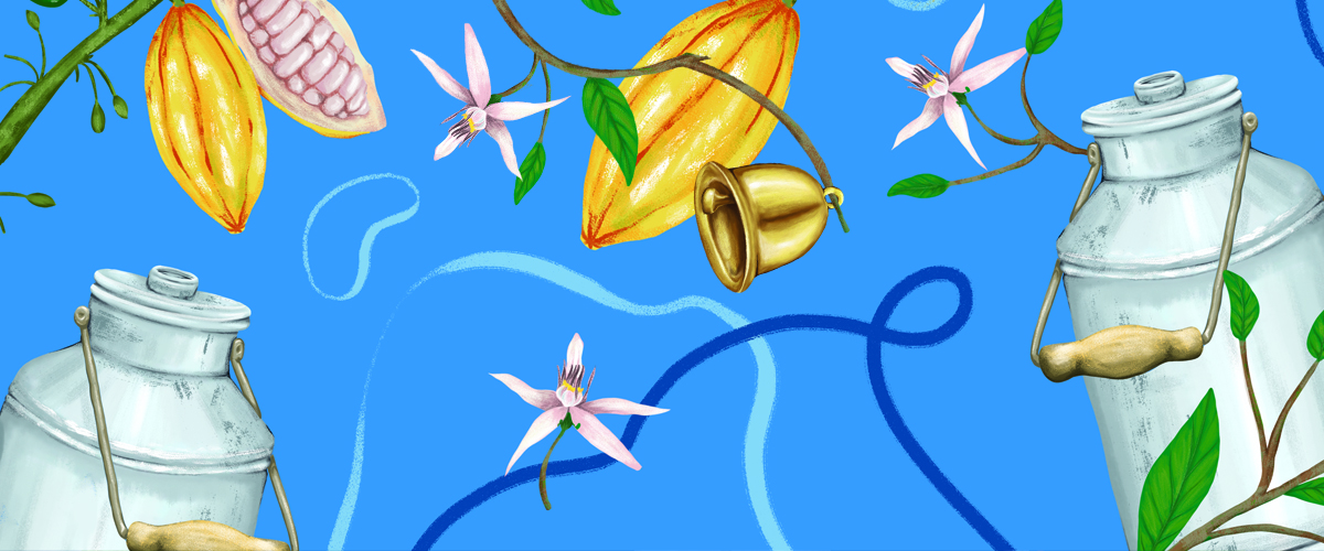
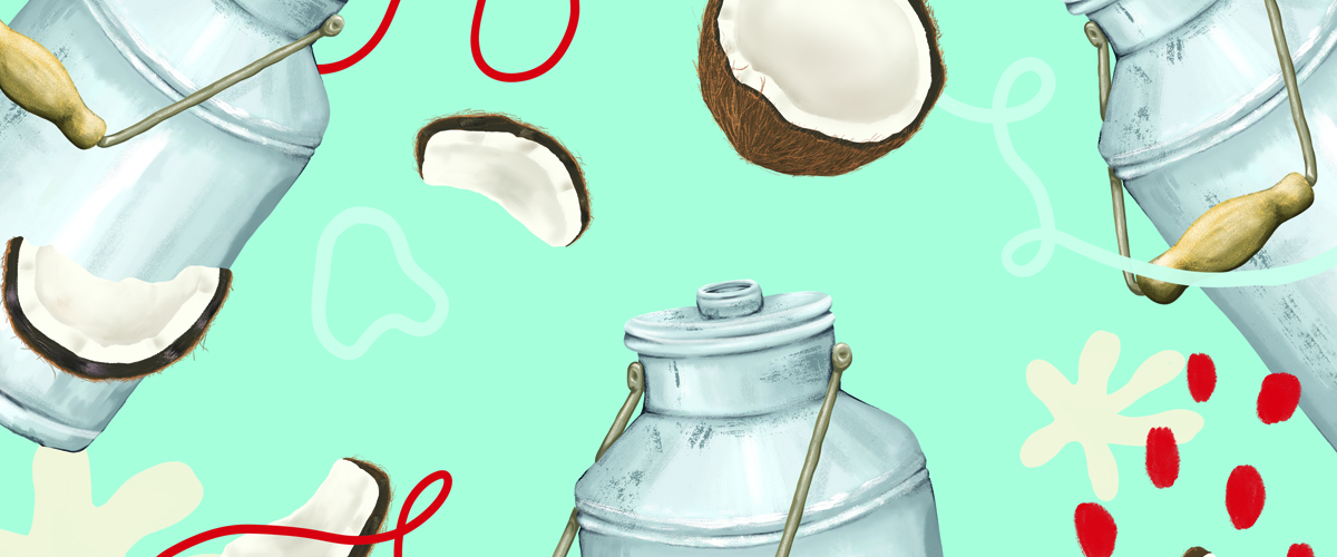

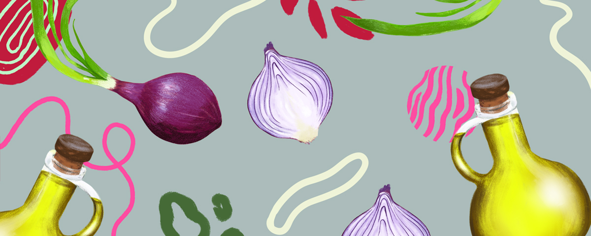
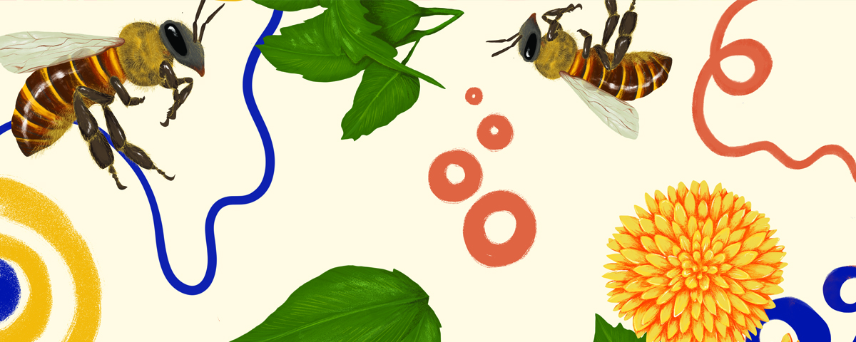
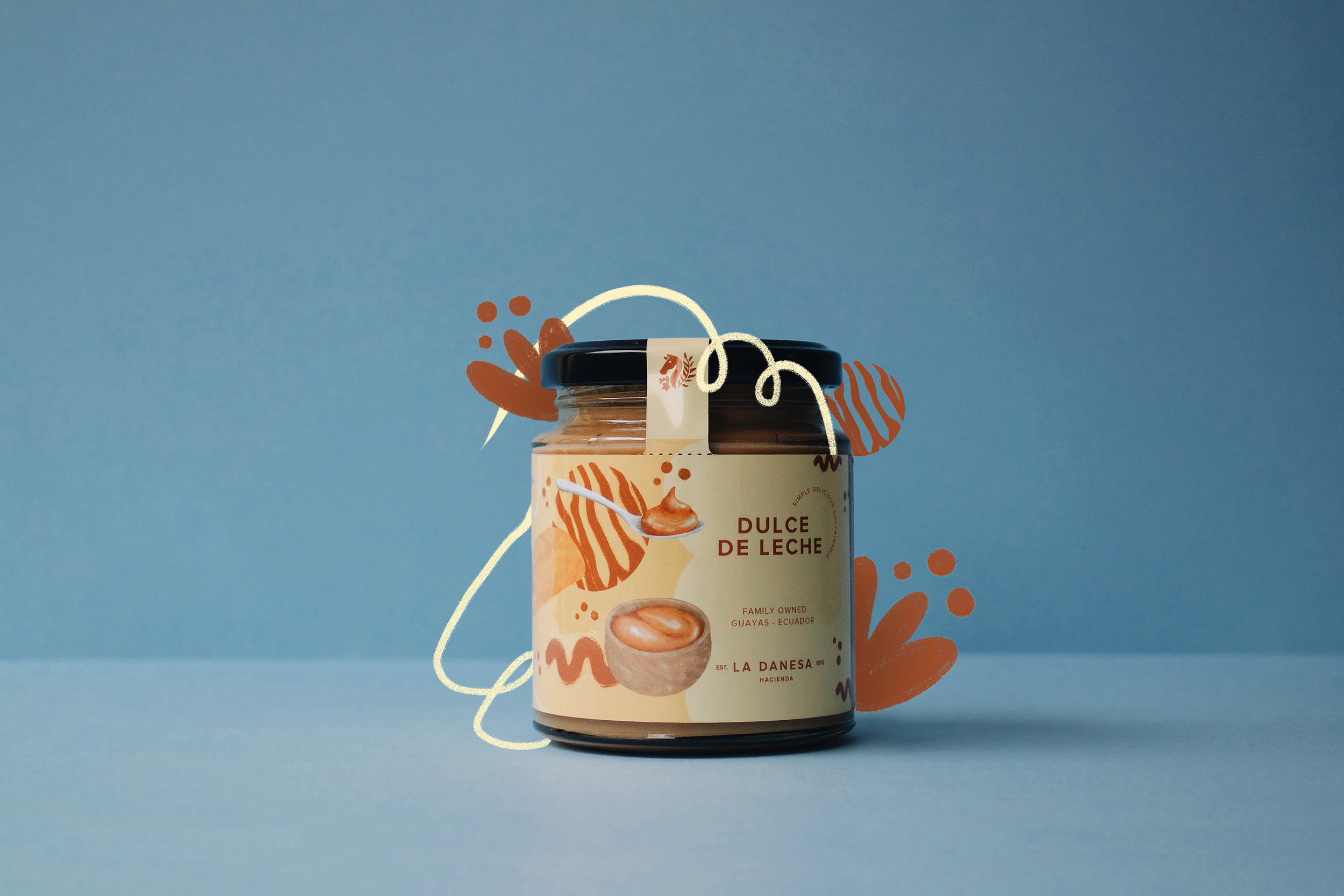
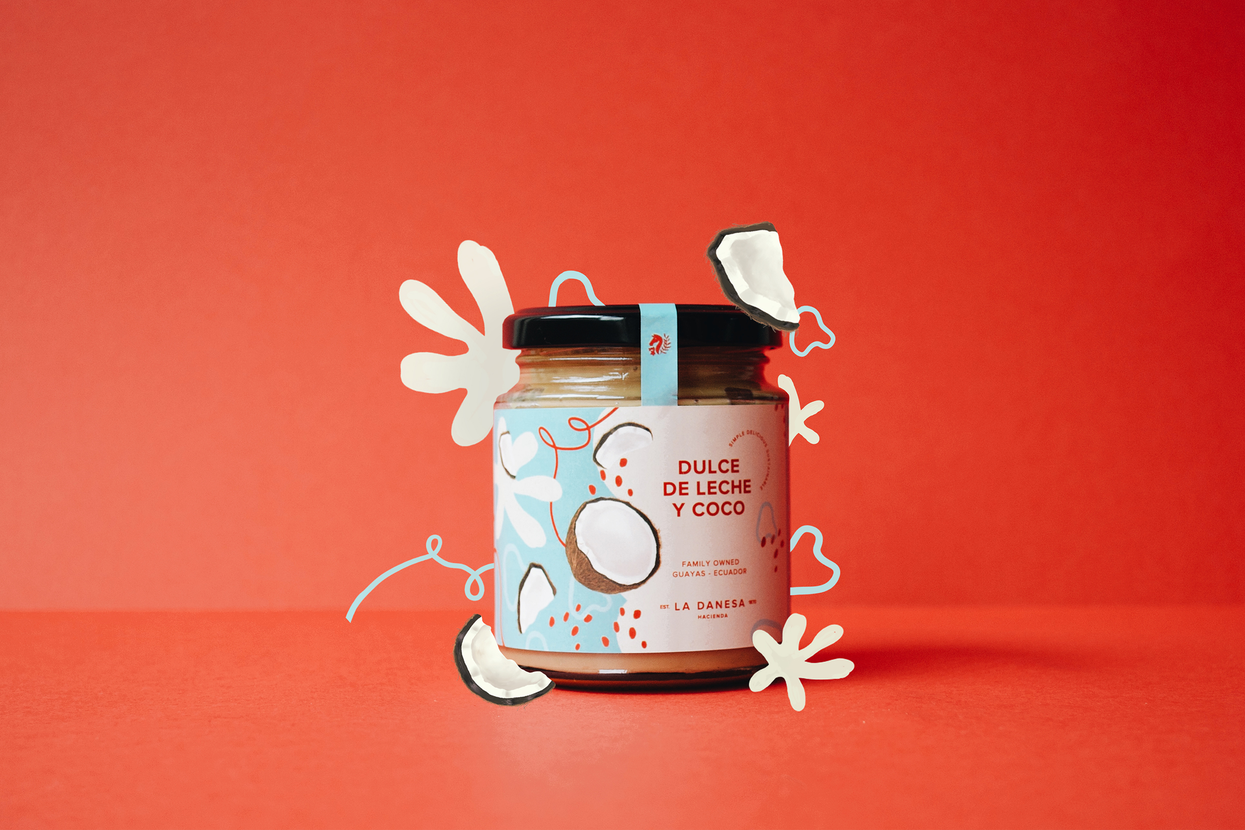
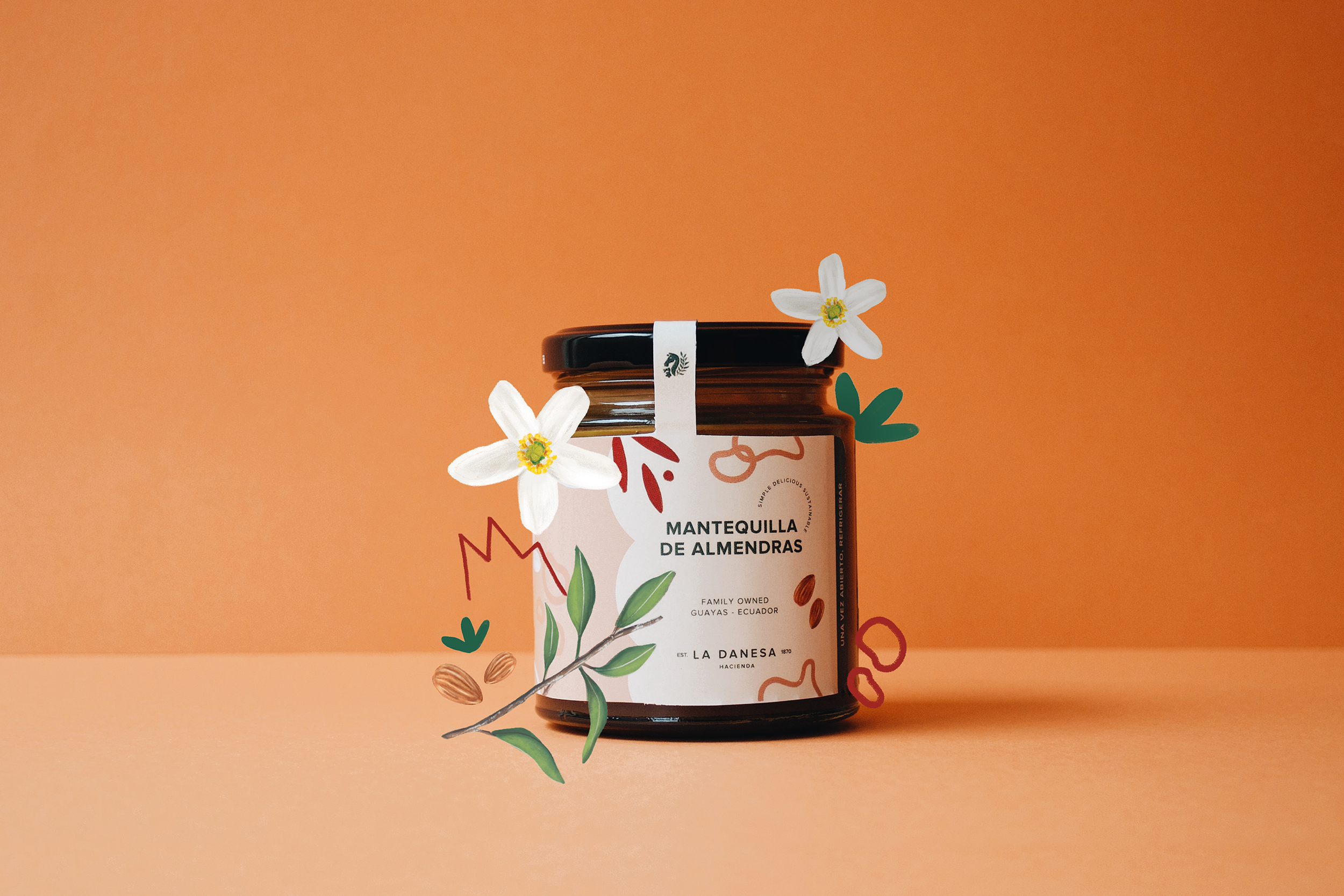
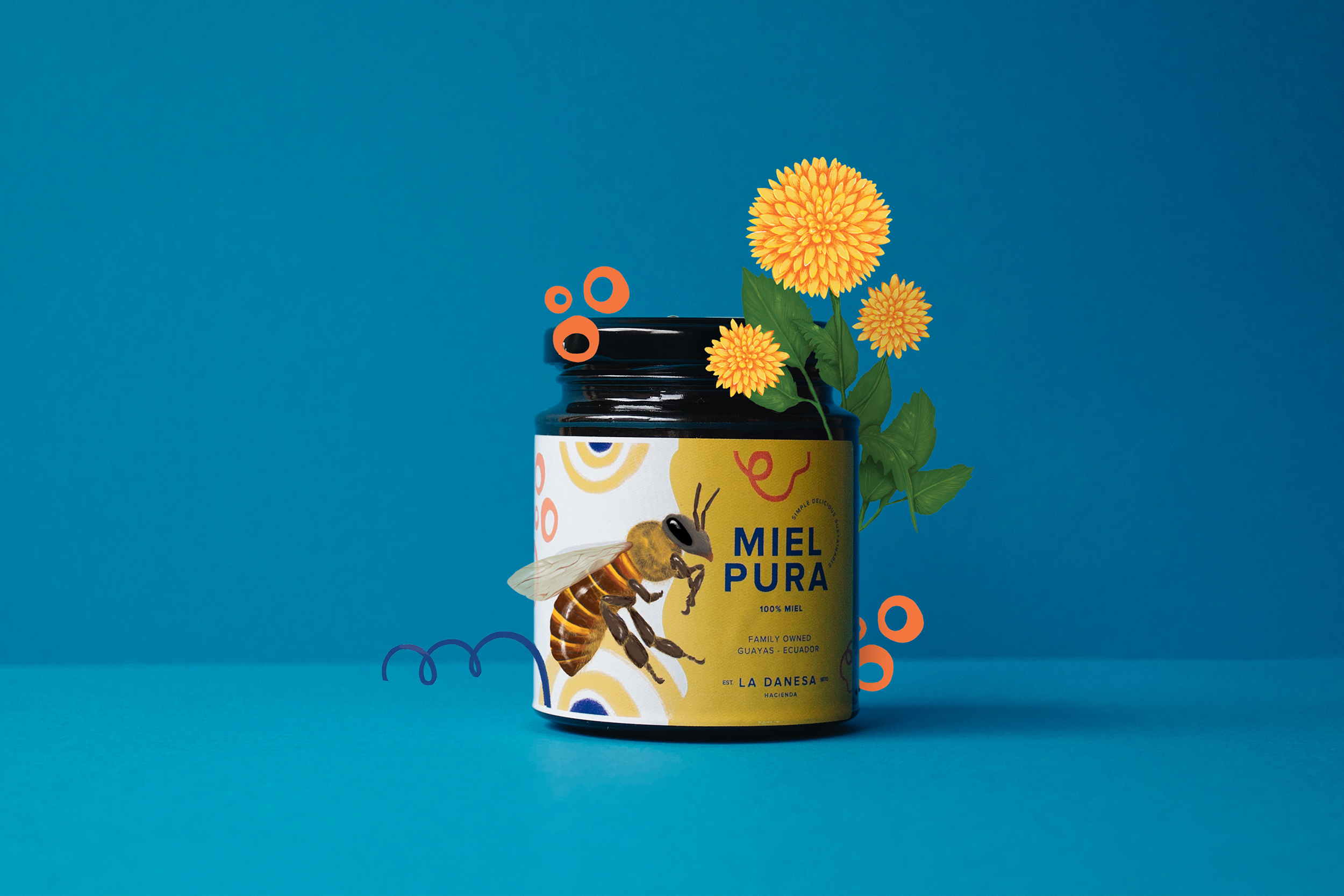
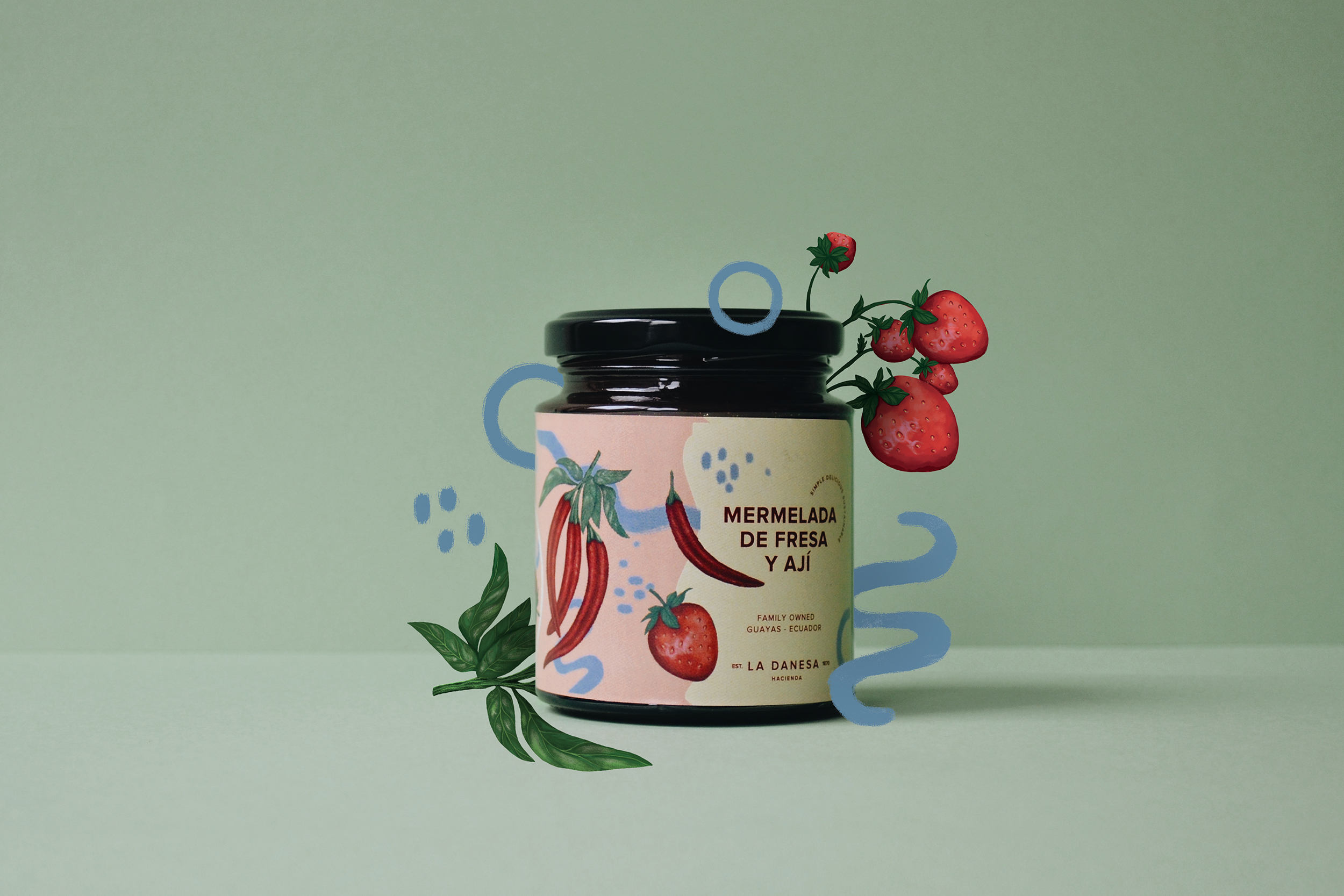
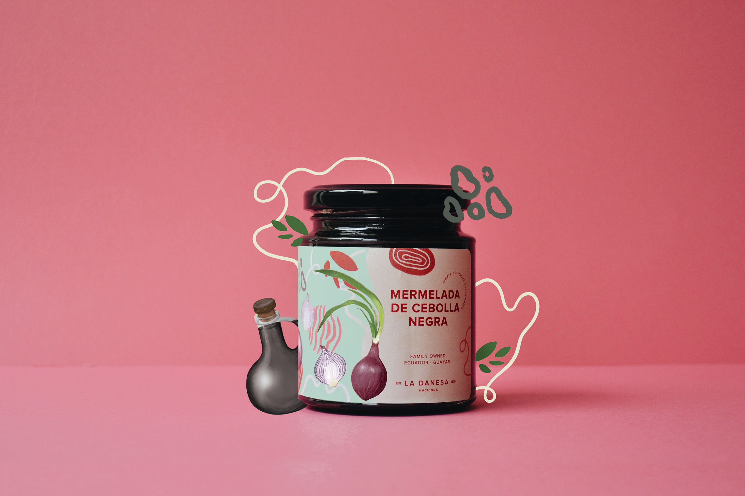
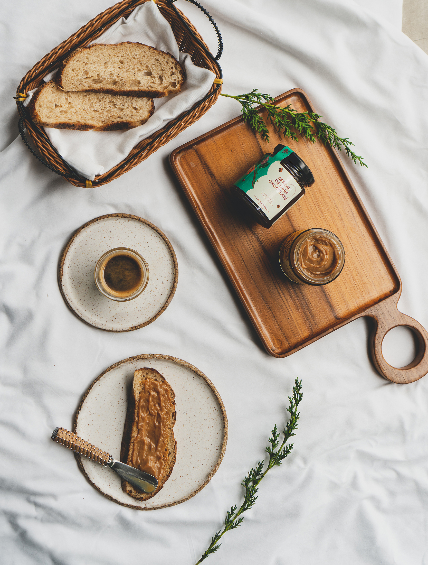
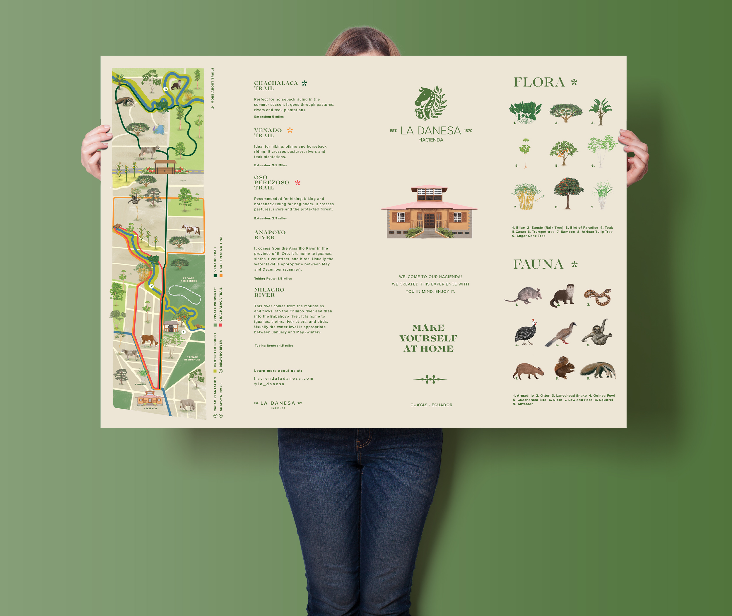
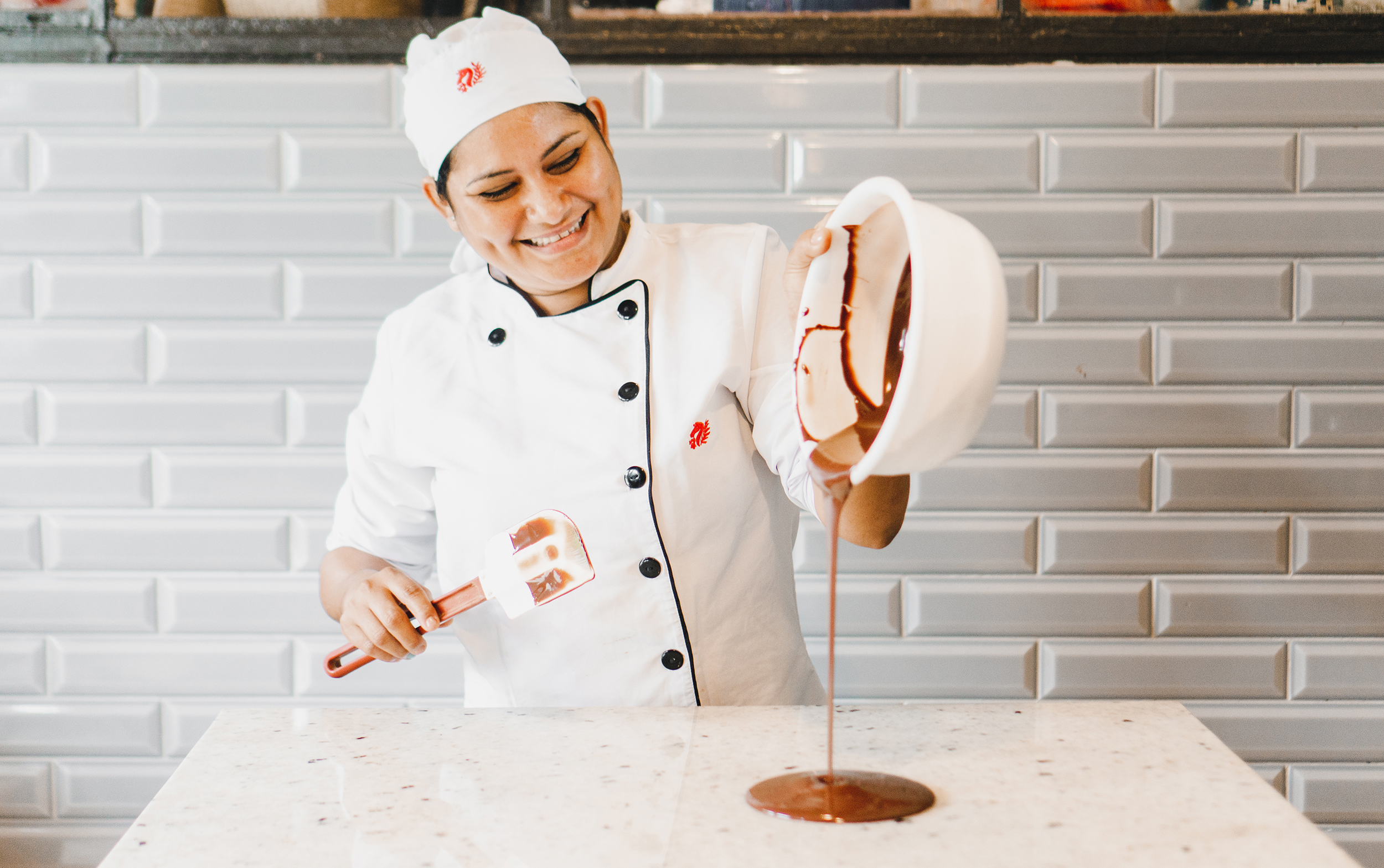
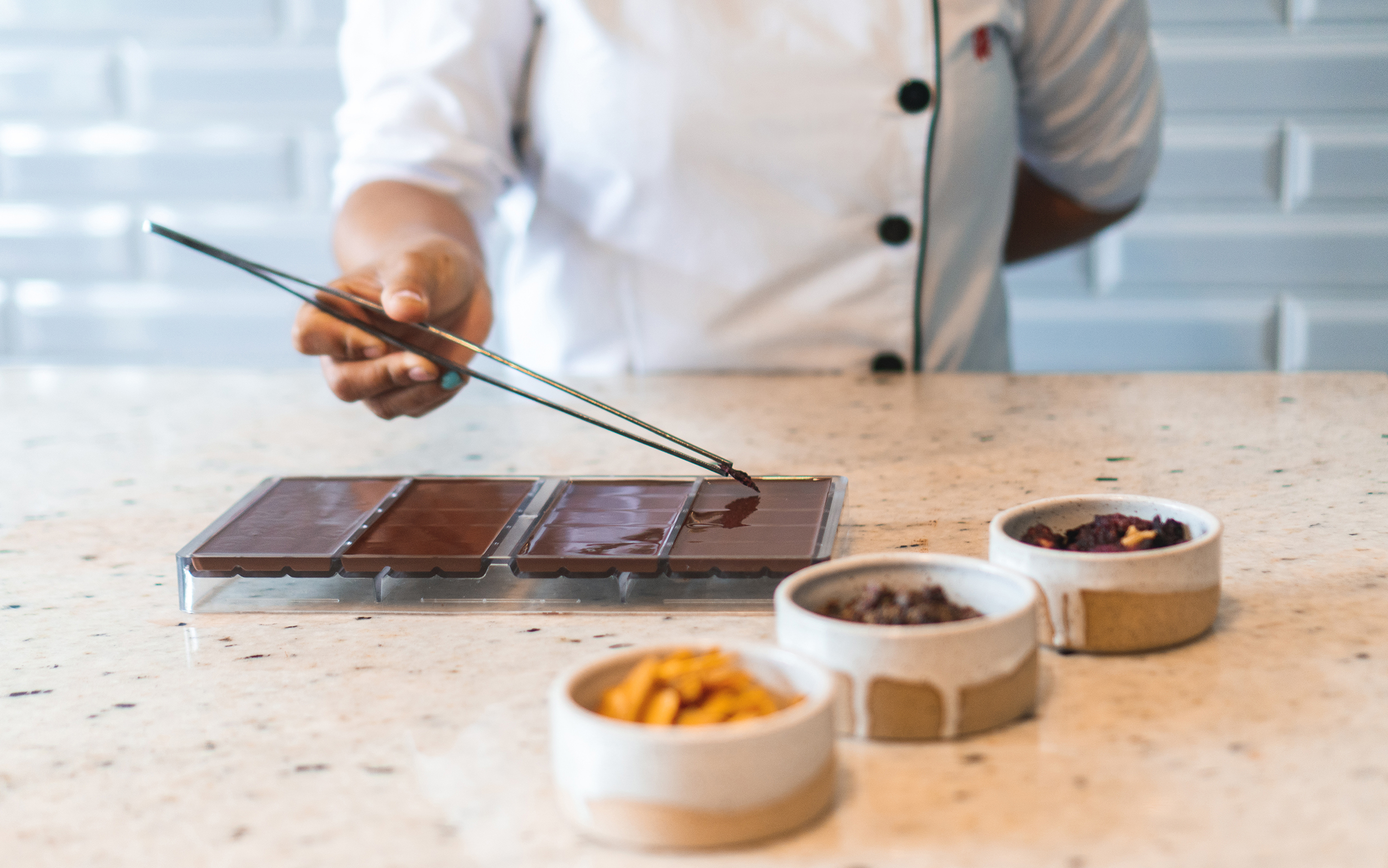
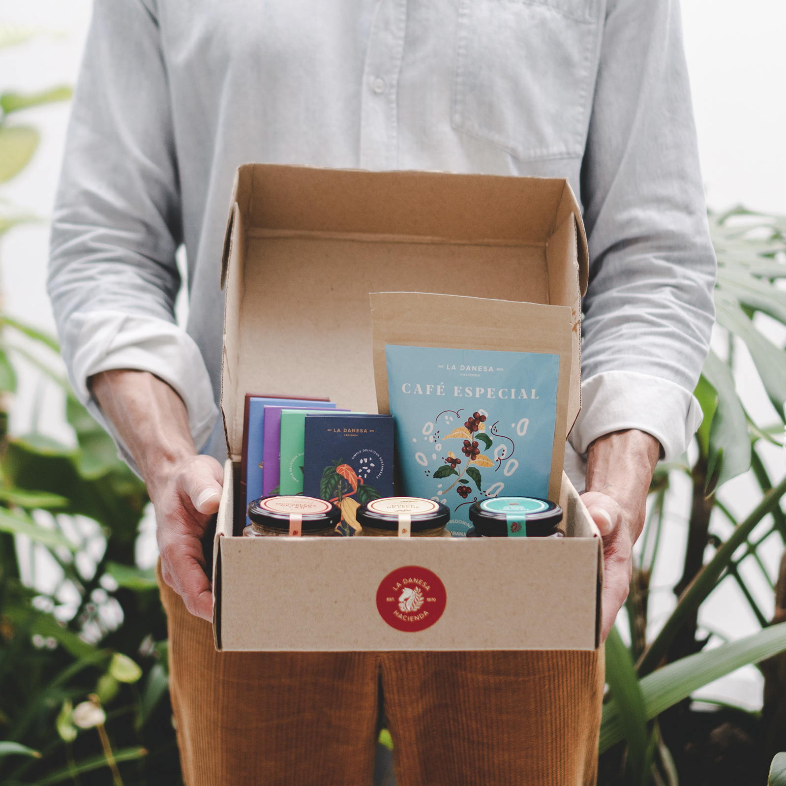
It all started with an illustration project for their home-made products. La Danesa is a work hacienda; they do their own jams, dulce de leche, cheese, honey, and chocolates. For the packaging, we created traditional botanical illustrations with a psychedelic touch to make it more modern and playful. Niels liked it so much, he decided to rebrand La Danesa with us.
Tu hogar fuera de casa
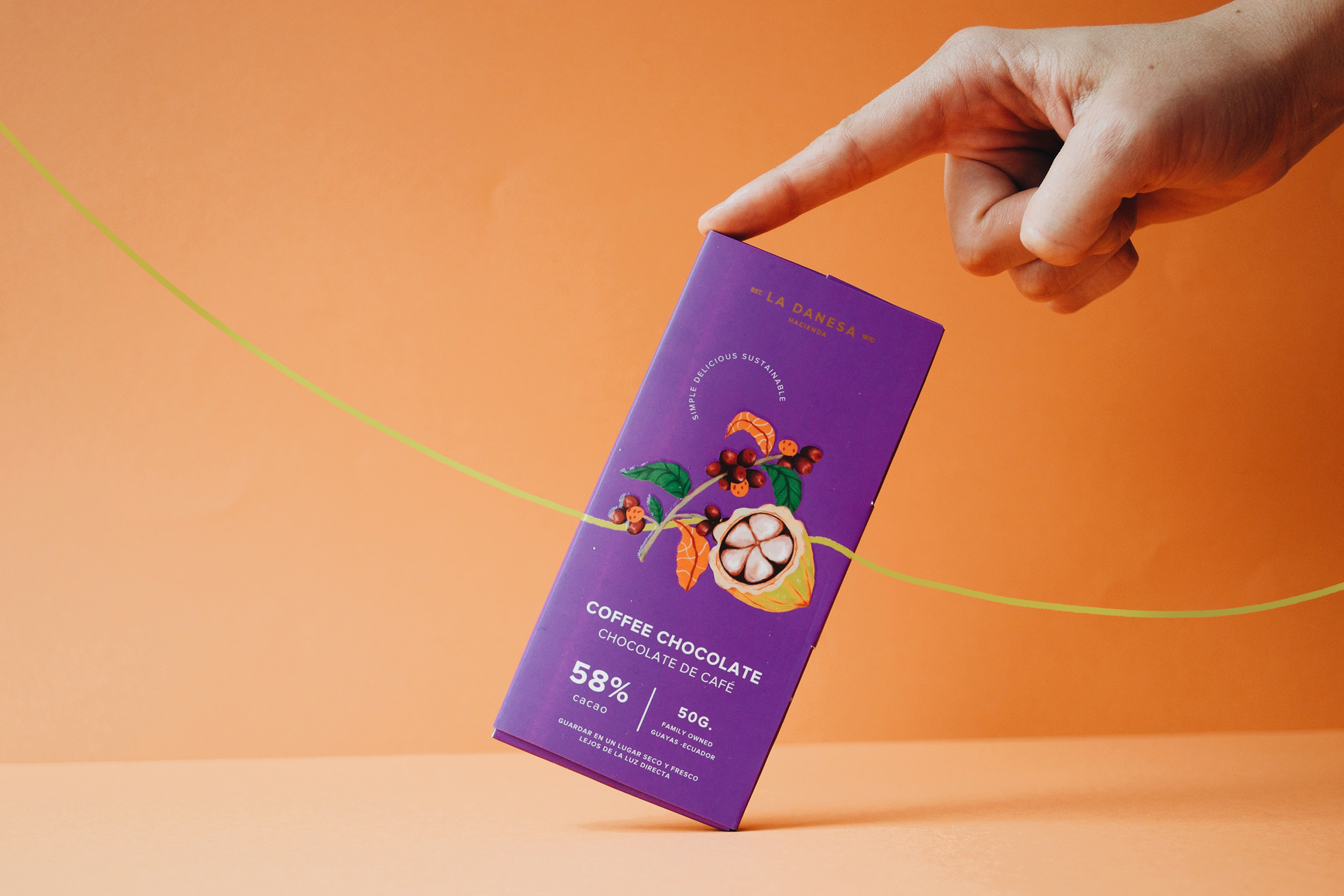

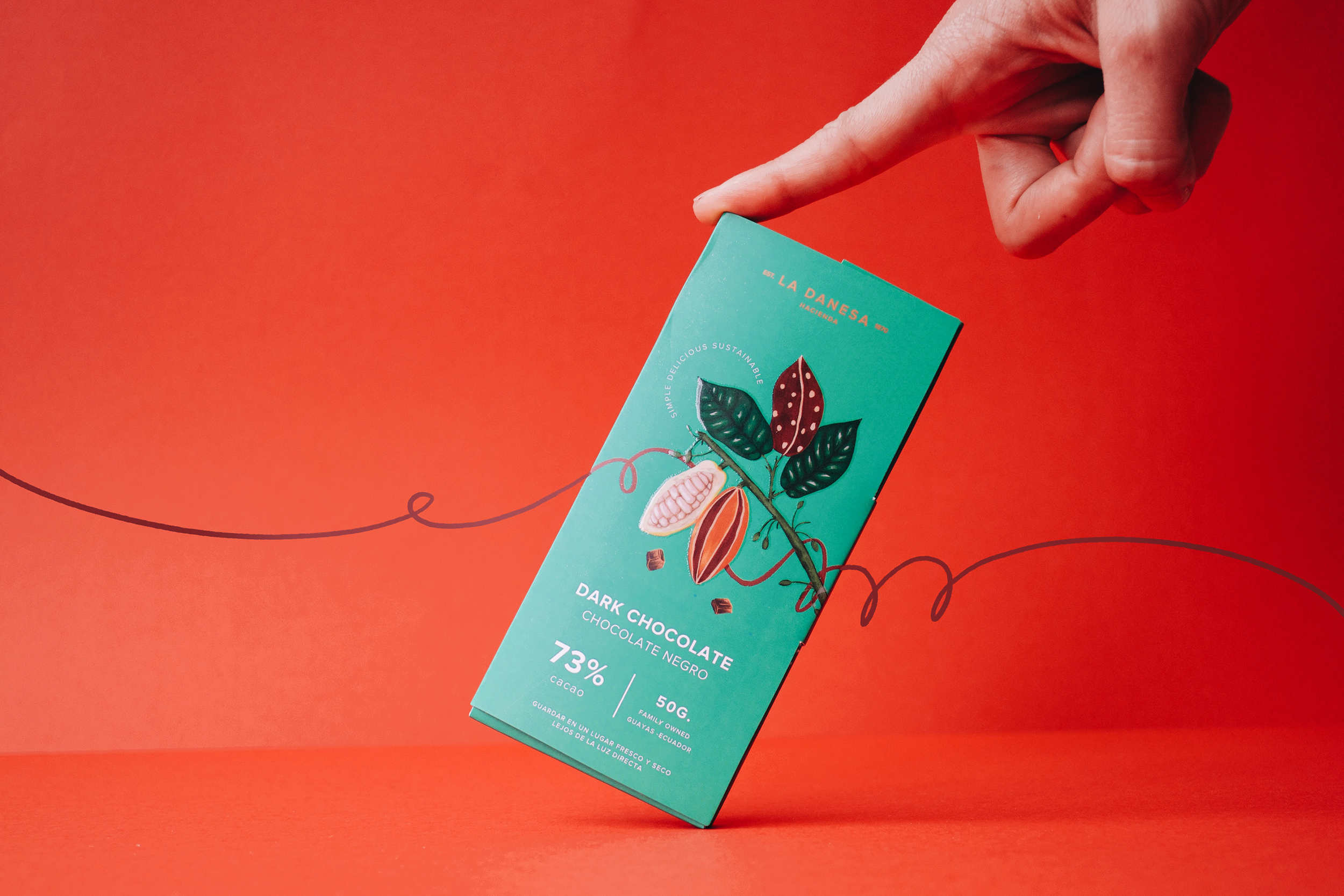
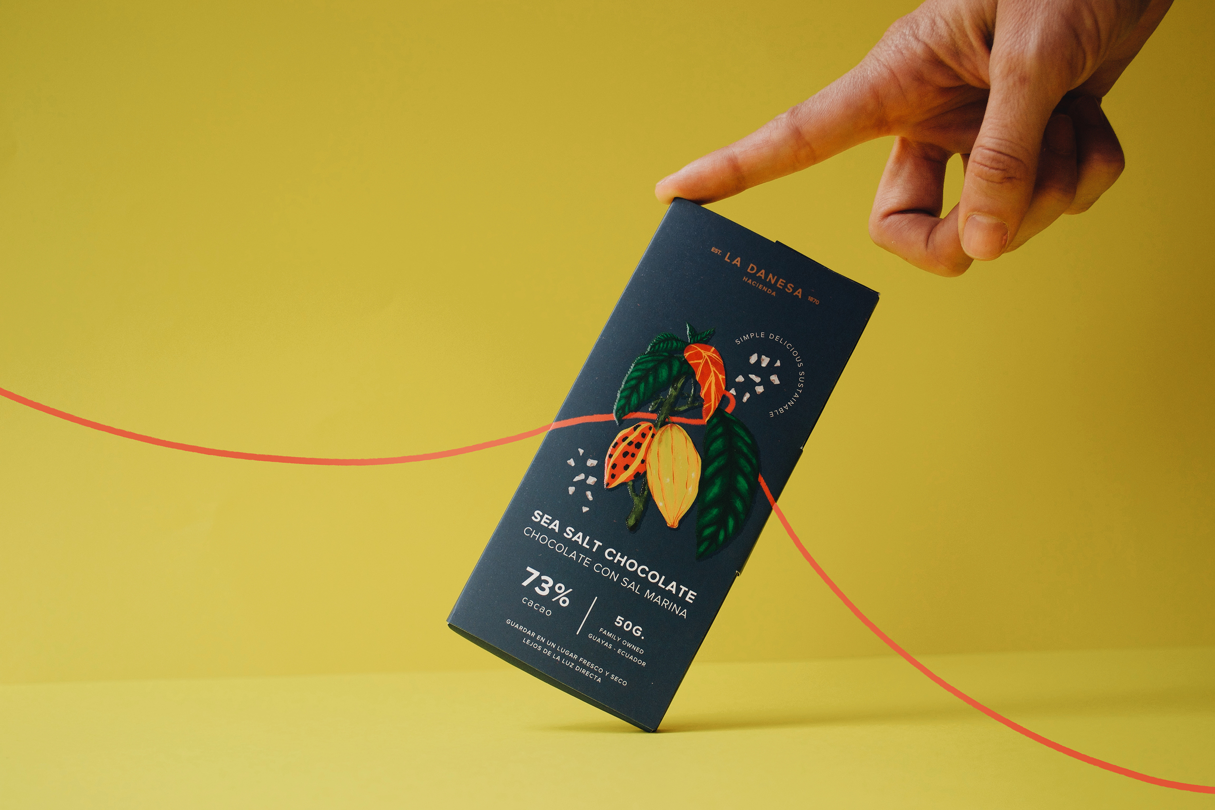
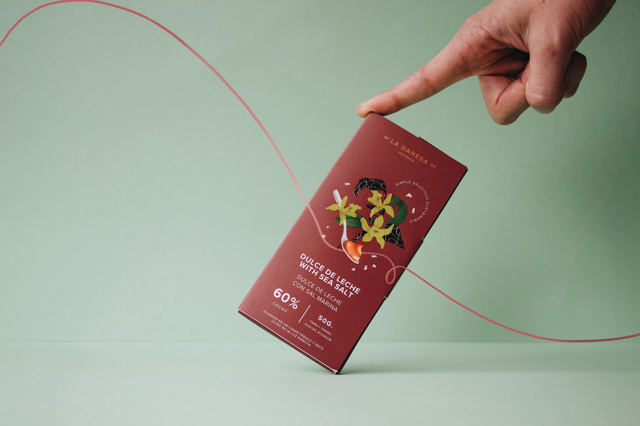
La Danesa is a family farm; the people who work there have been working with the Olsen family for decades. It was important for them that the warmth and familiarity stood out in the branding. After trying out a few logo ideas, we landed on the horse: the quintessential face of haciendas everywhere, surrounded by elements of nature that speak of the experience in the farm: a true Ecuadorian country experience. We chose a warm palette with earthy colors to continue the nature-centric theme of the brand.
Our favorite part of this project was developing brand applications and storytelling. Niels told us that one of his favorite things about La Danesa is that he gets to sit down with his guests, have dinner, drink some wine and share stories. The experience travelers have in the hacienda is so intimate, we took the chance to create a language that feels close and personal for the branding. For greeting cards to the brochures, every detail was designed to make people feel at home even if they came from the other side of the planet.